Settings Design
How might we design better “Settings” for administrators so they have more control and can be more efficient in managing their teams?
Compared to the Video Maker and the Video pages, the Account Settings was less accessed by the users, it did not get the attention and was overlooked. However, with the change in the company business needs and the release of the new HTML5 Video Maker, Vyond decided to redesign the Settings screens. I, along with a UX designer and a UI designer, set off to improve the user experience of the Settings design.
TEAM
Head of Design
UI Designers
UX Designers
Engineers
RESPONSIBILITIES
Information architecture
Competitor research
Prototyping
UI design
The Problems
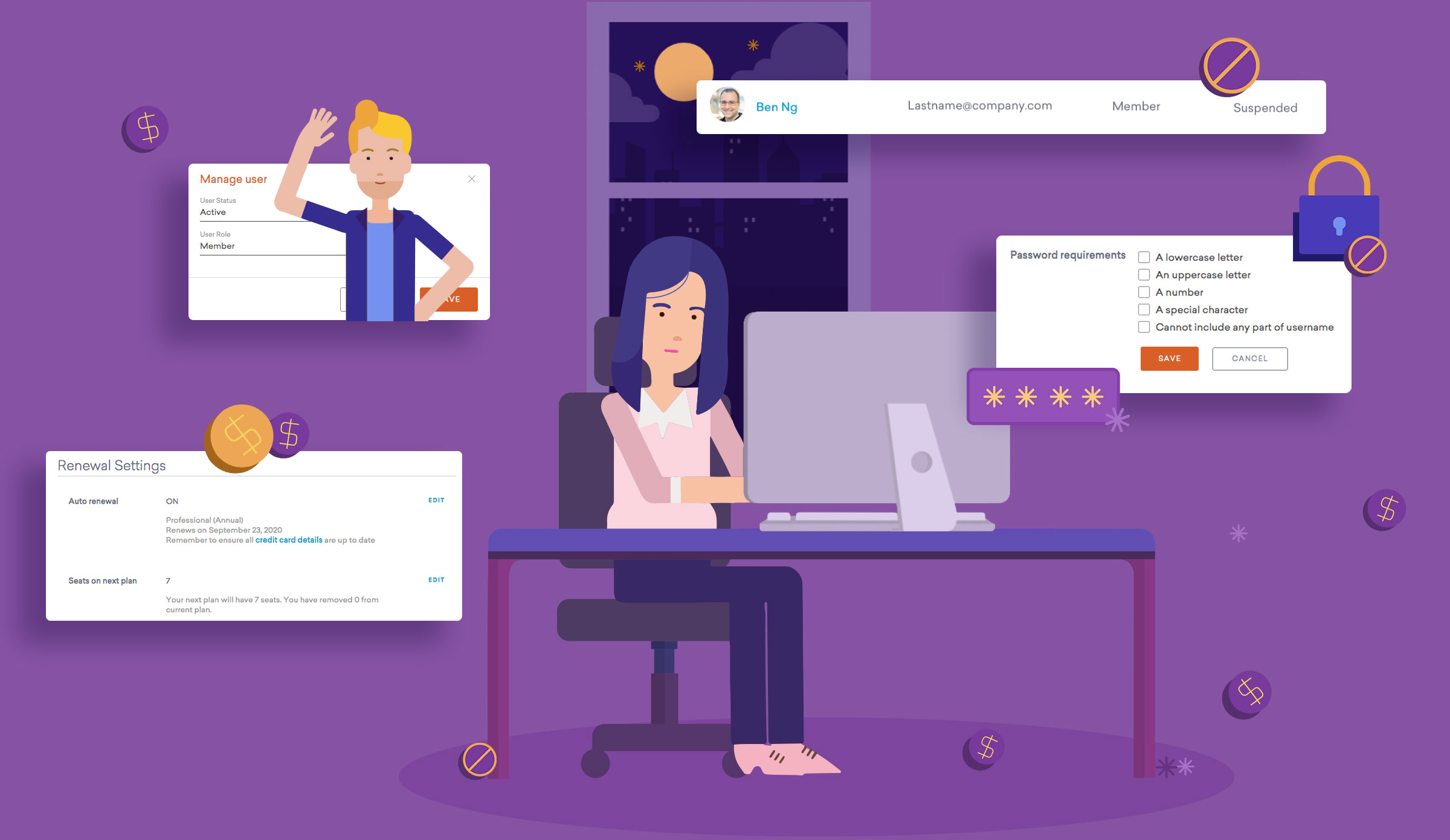
The Settings design is not a shiny type of design. It is something that users need but don’t use frequently. I think it is a challenge to make the Settings simple and easy to use, so that the users can focus on what is really important, ie. video making.
PROJECT GOALS
01 To clean up site architecture
02 To create reusable and flexible UI components for future growth
03 To update and standardize the Account Settings UI with Vyond's design system
04 To enable administrators to delete accounts/ transfer content to a different account
05 To update the Settings visual design so that it is aligned with the new Vyond brand image
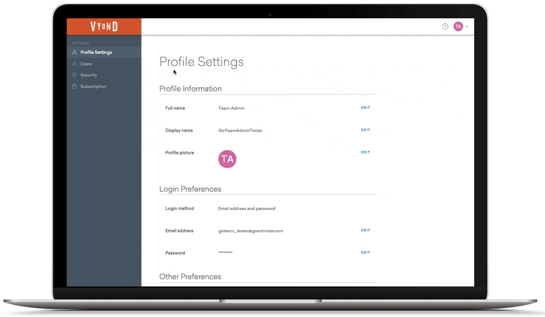
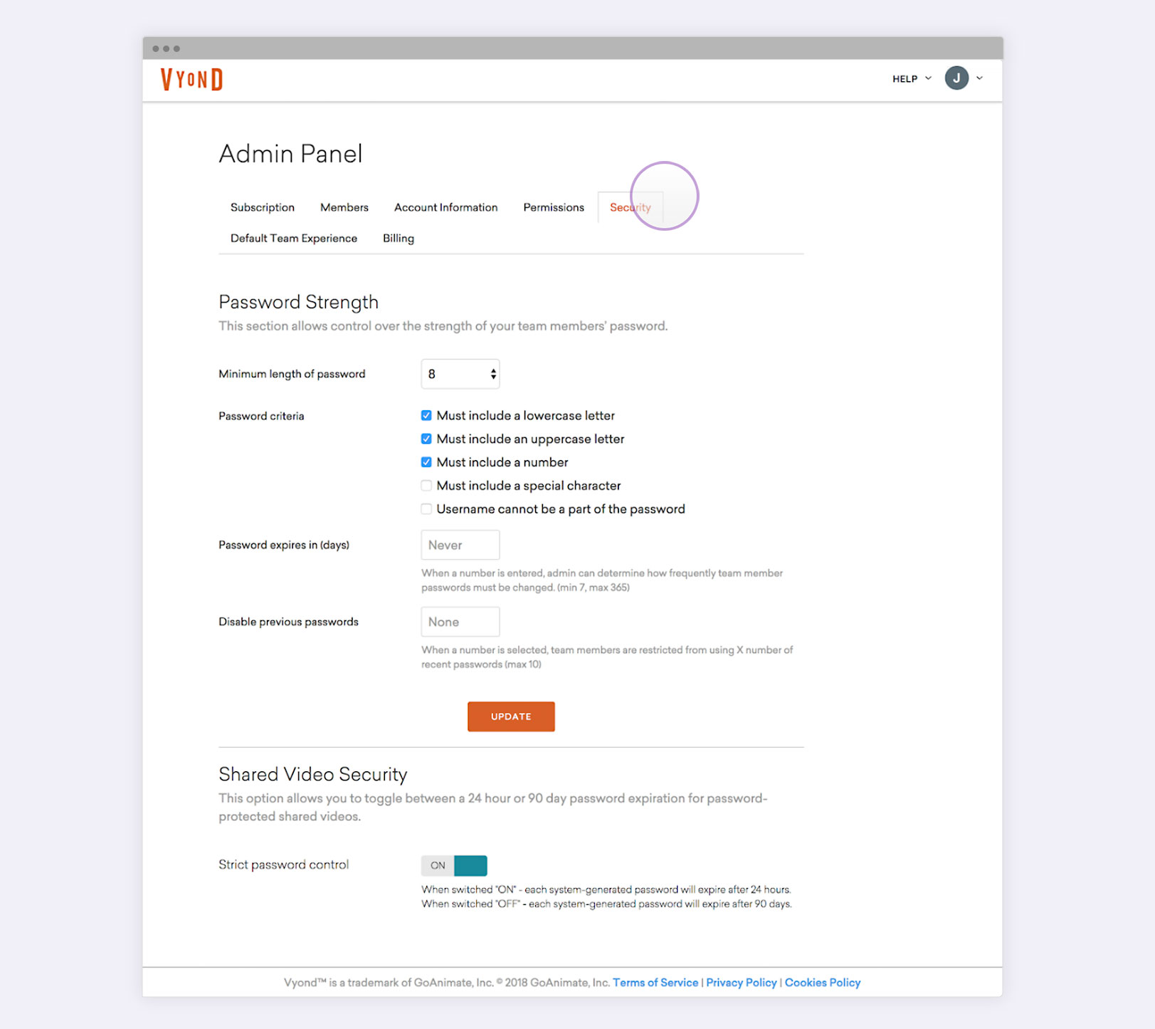
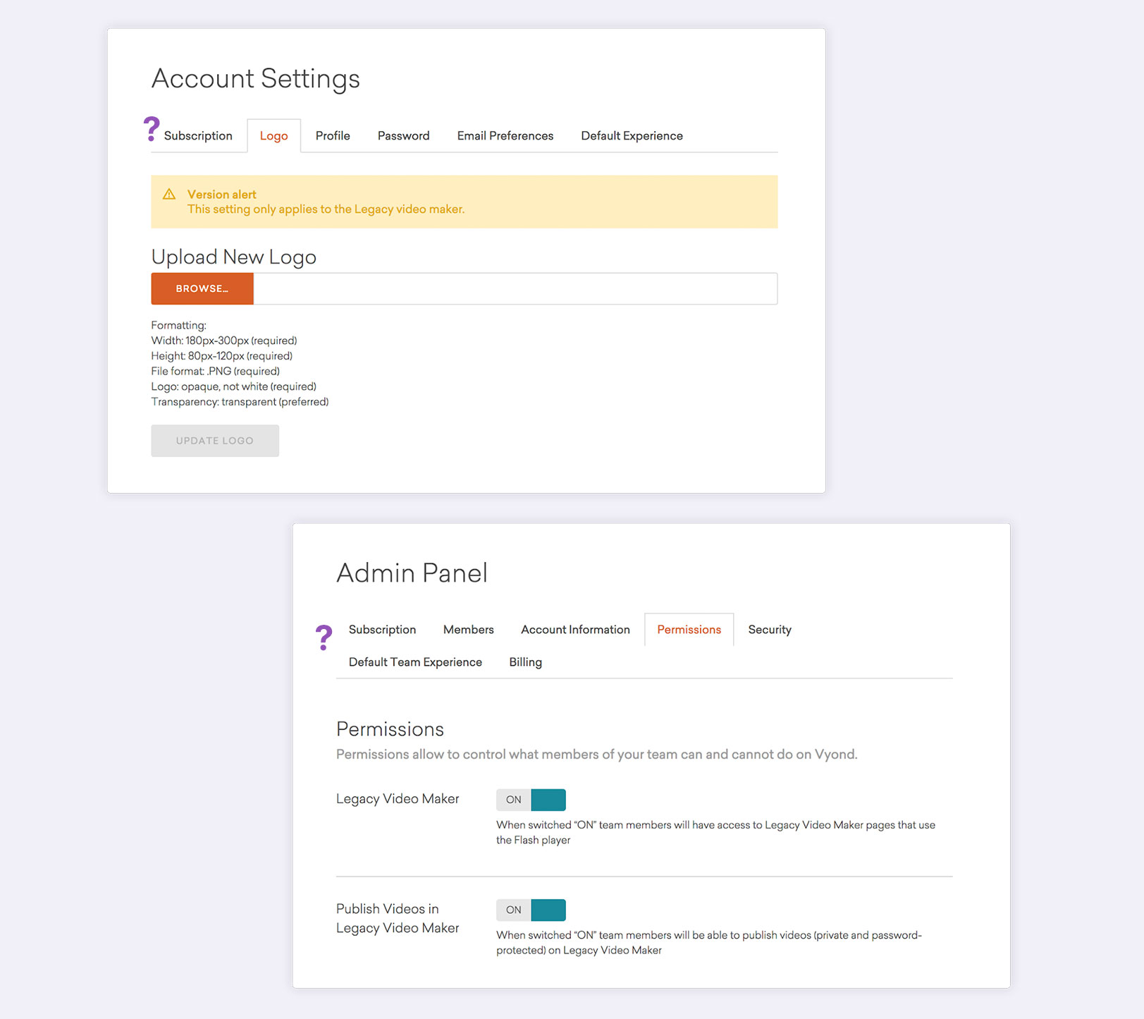
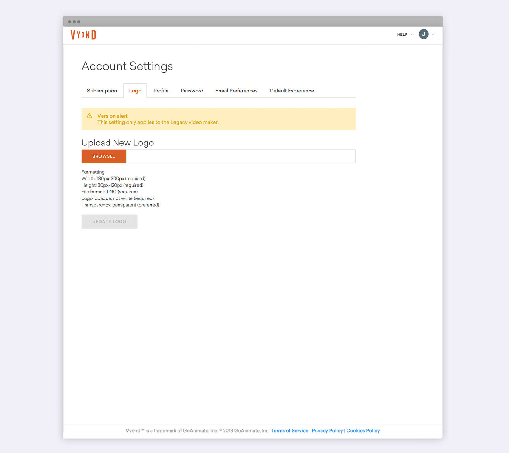
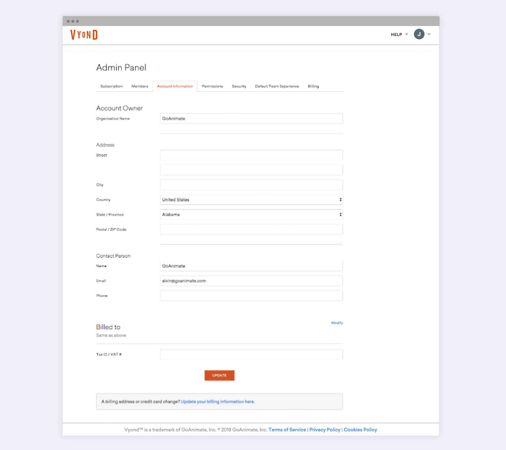
BEFORE REDESIGN
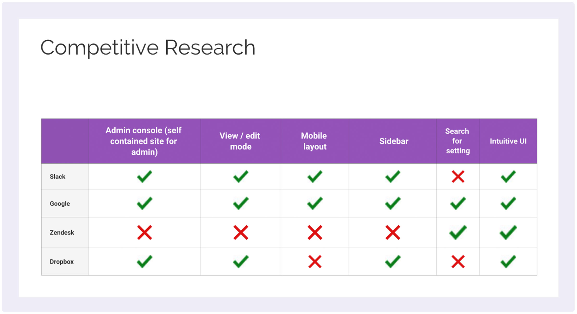
Competitive Research
FEATURE INVENTORY COMPARISON
One of Vyond's objectives is to provide a professional video production tool for team collaborations. So I referred to indirect competitors such as Slack, Goggle and Zendesk for enterprise Account Settings inspirations.
We reviewed their navigations and information architectures so that we gained insights into better structure and grouping of the Settings.
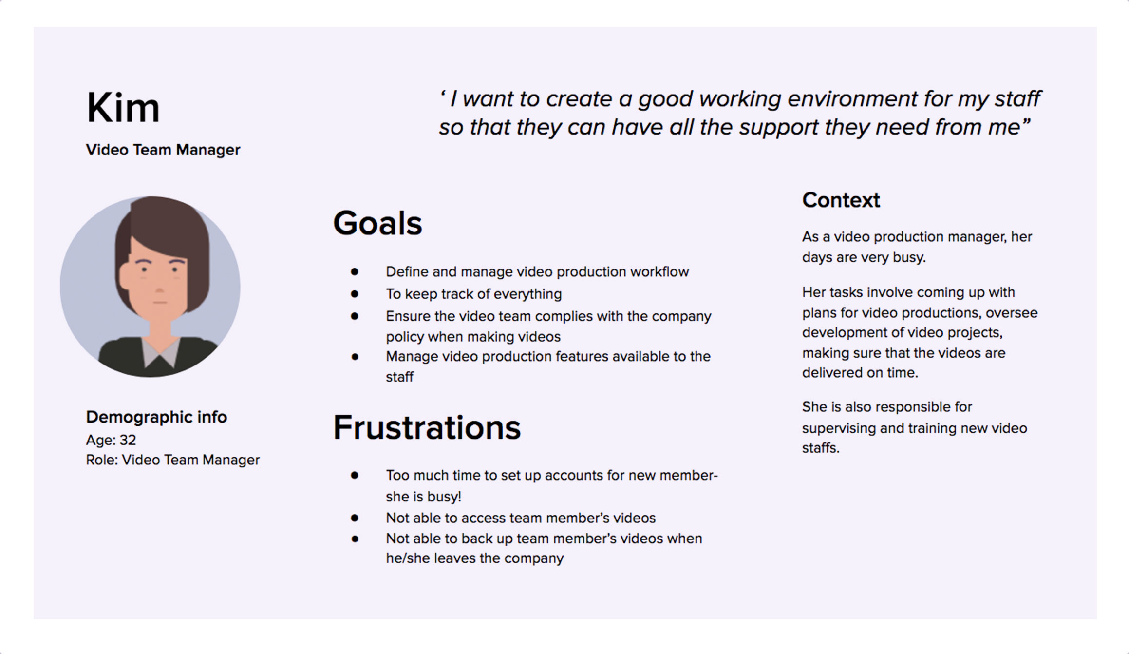
Curating User Personas
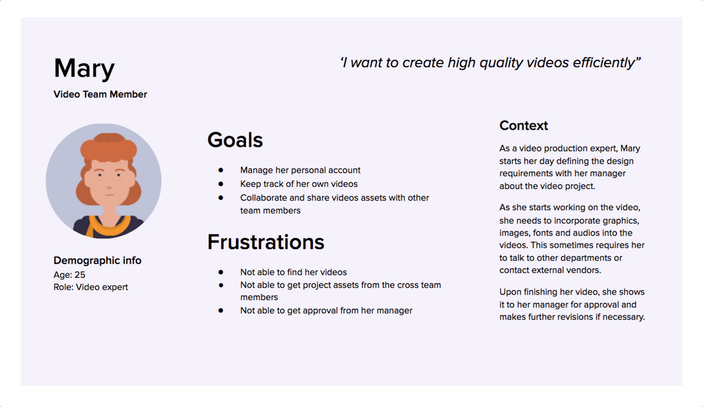
To better understand our users, we identified 2 user personas:
01 Kim — Team administrator
02 Mary — Team member
The primary user that we focused on was Kim.
Start with User Goals
With the help of the product owner, we came up with different user goals and flows.
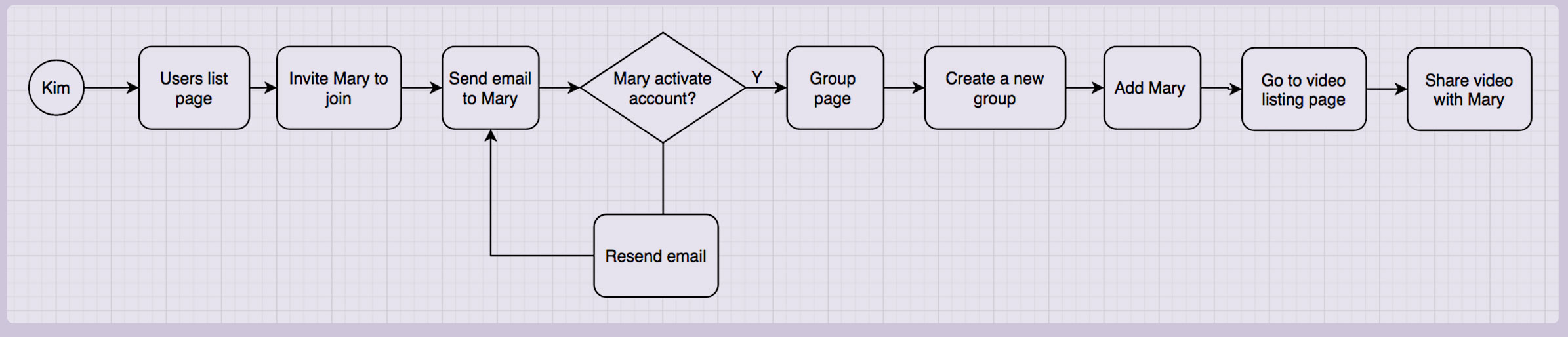
USER FLOW 1
Kim wants to invite Mary to join a new group and share video assets with her
USER FLOW 2
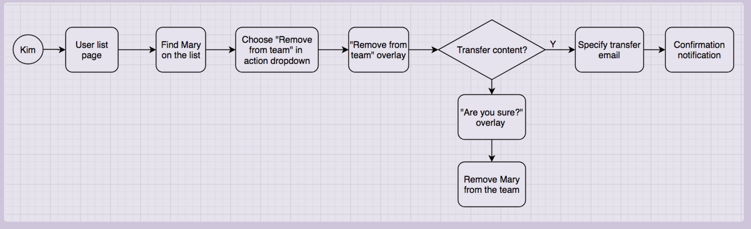
Kim wants to remove Mary from the team and transfer Mary's videos to her account
USER FLOW 3
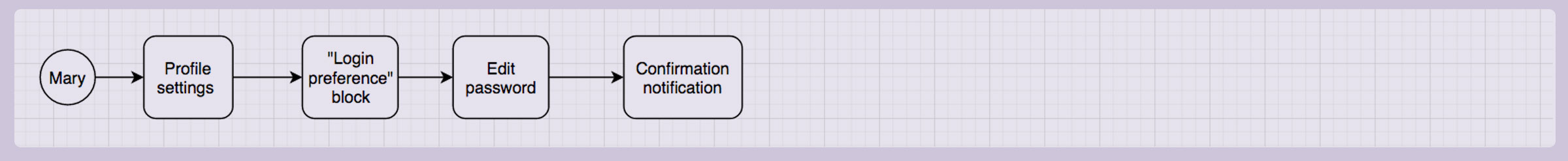
Mary wants to change the password of her Vyond account
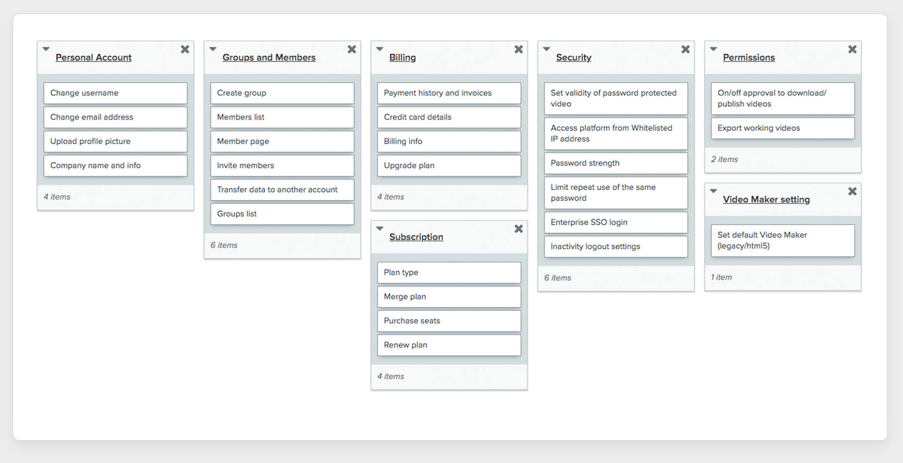
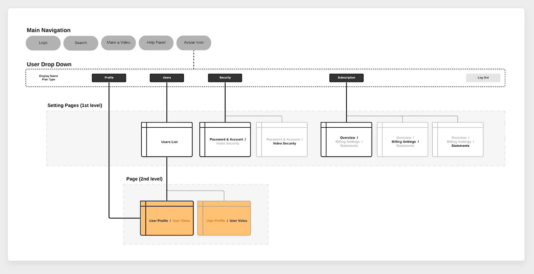
Information Architecture
GROUPING THE CATEGORIES
First, we did an audit of the overall Settings features. Then we conducted Card Sorting exercises to help to organize the navigation and content of the Settings pages.
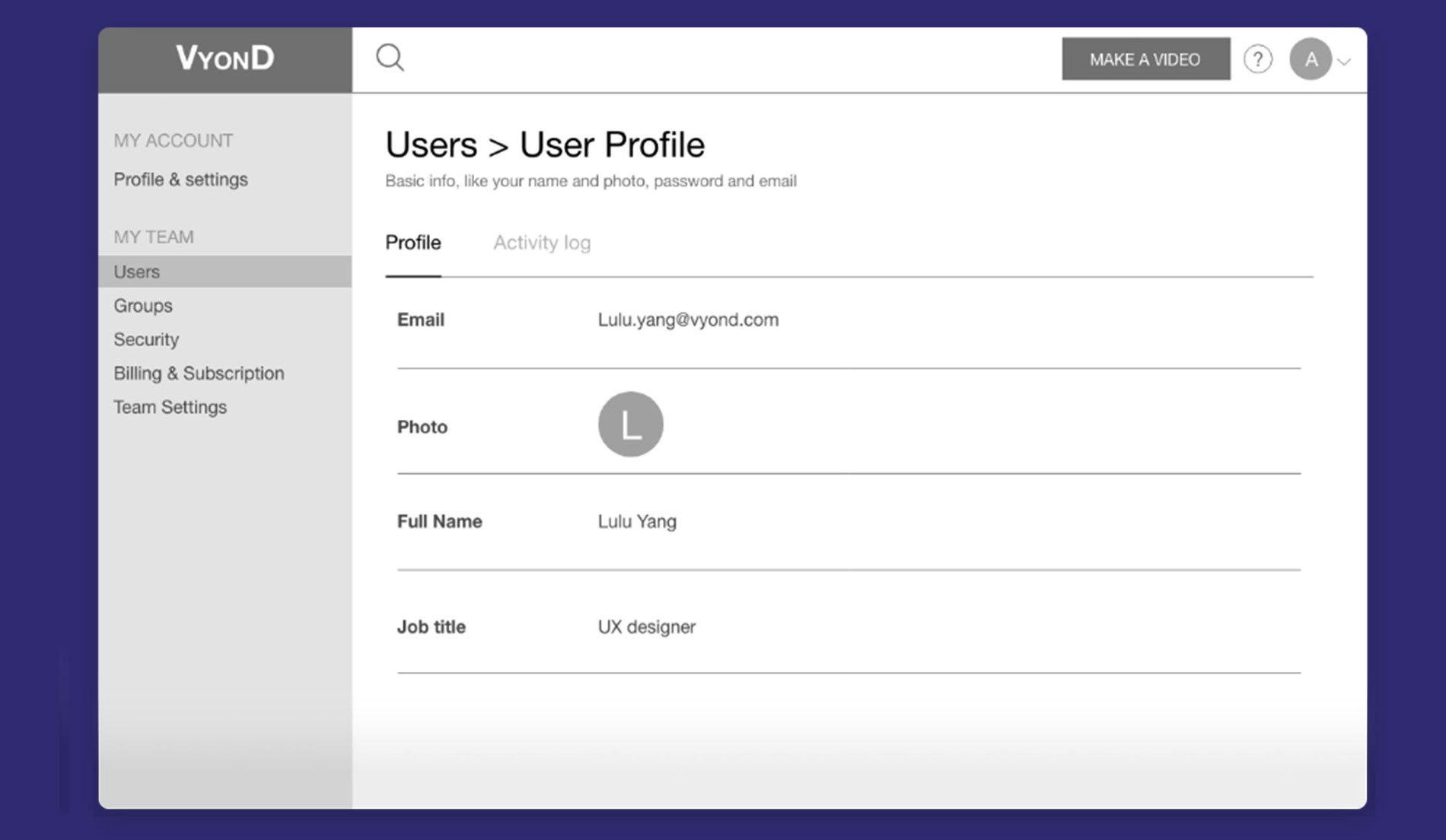
By analyzing and comparing the results, my UX colleague, Lulu Yang finalized the sitemap and we got a hold of the structure of the Settings design.
Ideation
WIREFRAMING
Having conducted researches and obtained insights, we started to explore the design solutions. Lulu created low-fidelity wireframes for discussions and we agreed on the main design directions:
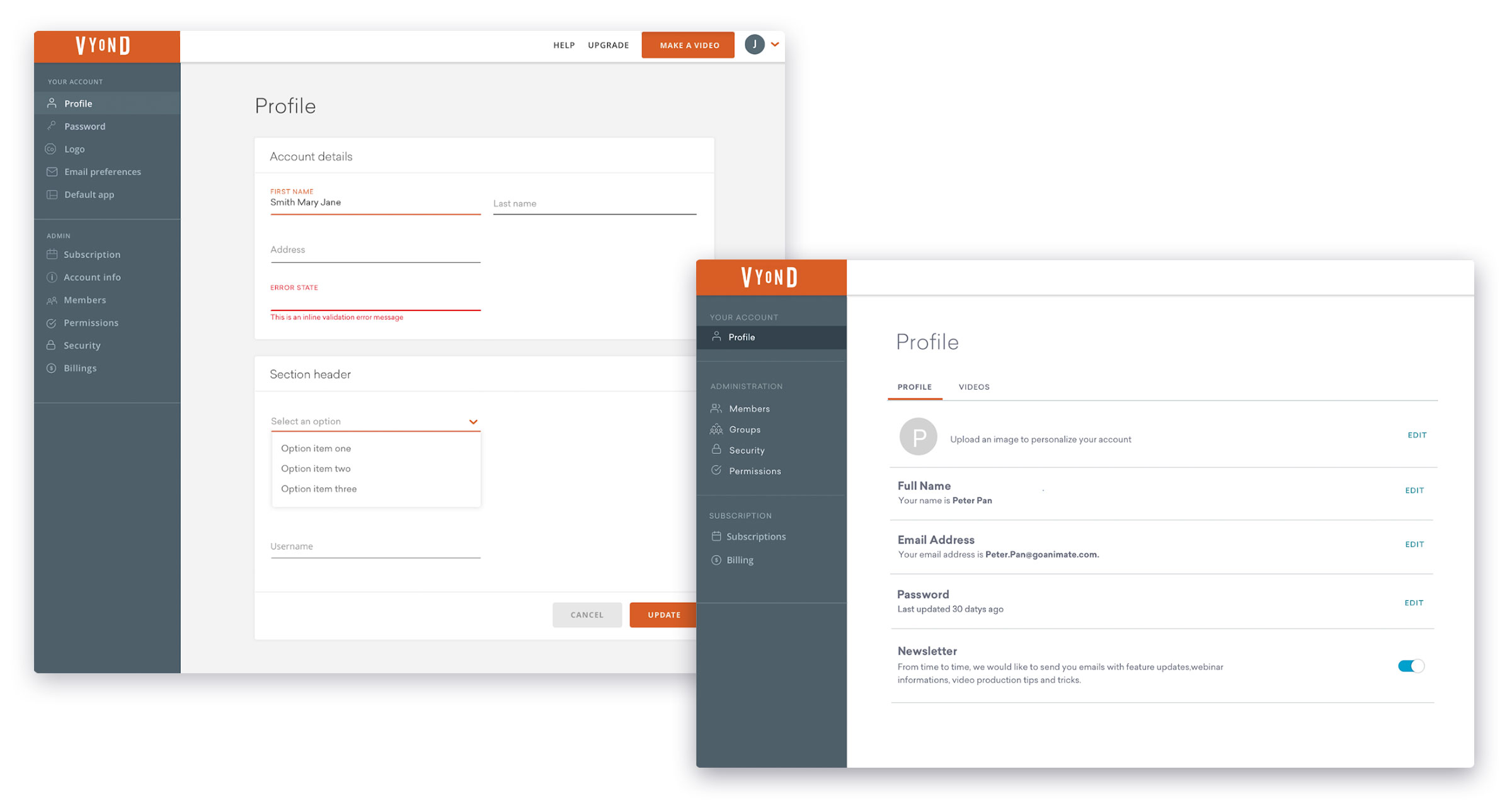
01 VERTICAL SIDEBAR
Instead of tabs, we thought a vertical sidebar could accommodate more categories in the future.
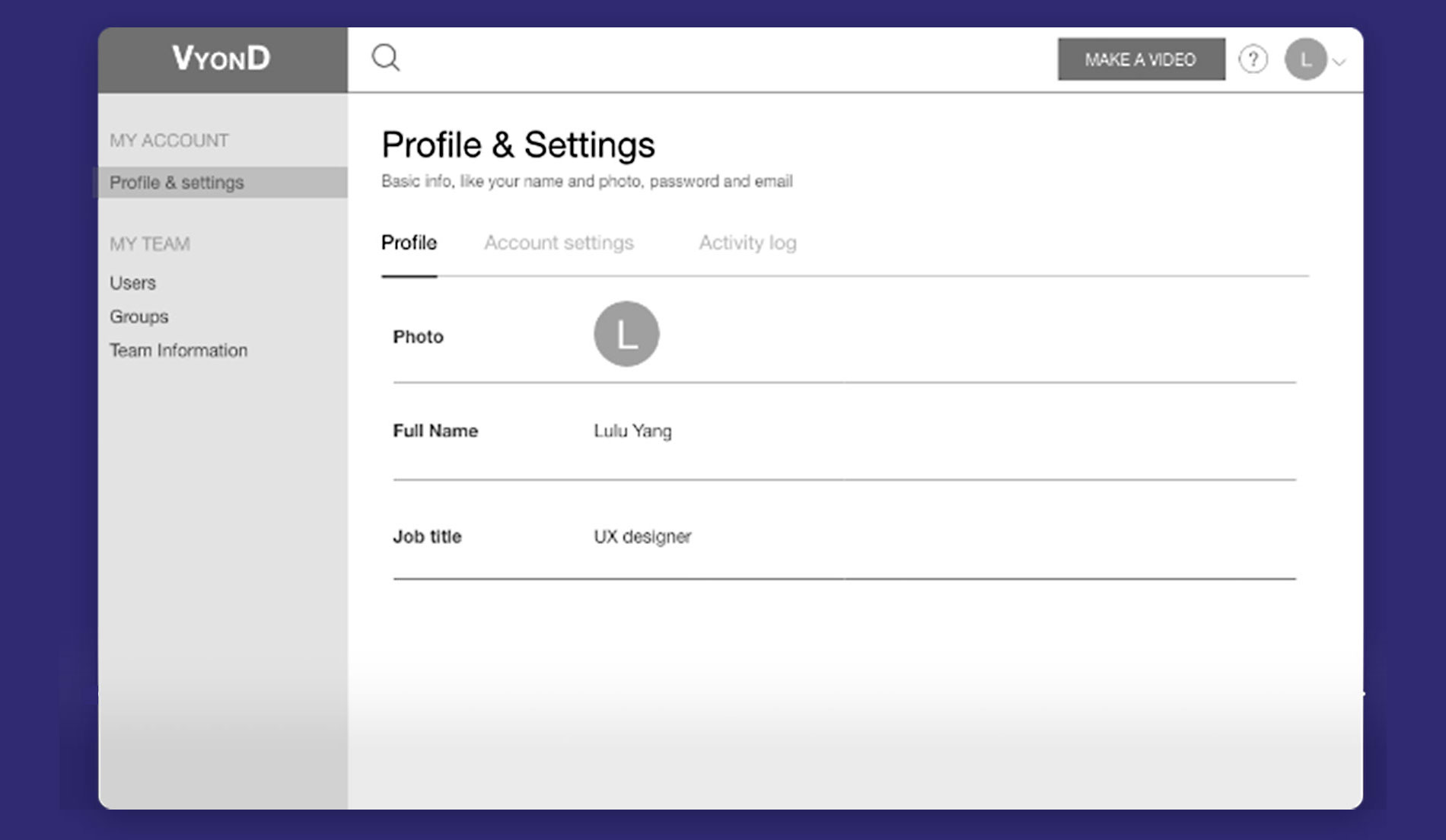
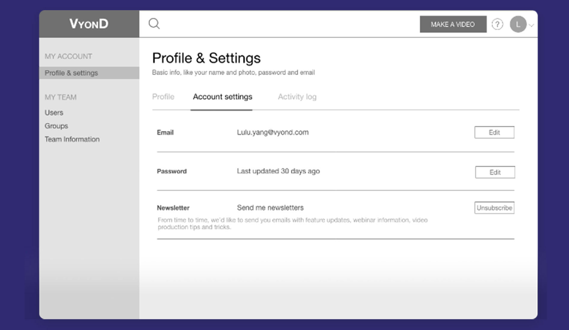
02 “INLINE EDIT“ DESIGN PATTERN
Inline Edit design pattern kept the page clean and scannable. The user would stay in the "Read" mode unless he/she clicked the "Edit" buttons and made changes to the settings.
Prototyping
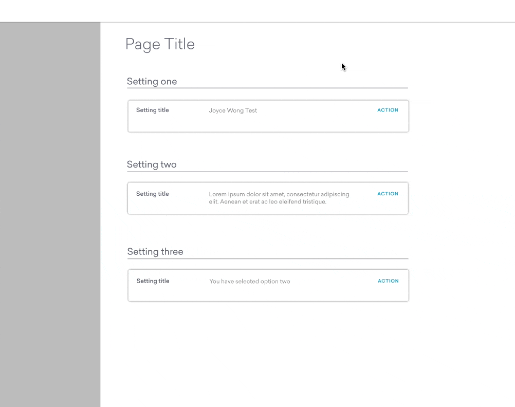
MID-FIDELITY PROTOTYING
We showed the initial wireframes to the design team. Their feedback was positive, and now having more confidence, I dived deeper more into the UI side with medium-fidelity mockups on Sketch; whereas Lulu focused more on the wireframe flows.
CLICKABLE PROTOTYPE IN XD
A clickable prototype was created in XD to test how the "Settings" component worked. We showed it to the developers and the design team for usability testing. We identified some usability issues and gained some useful feedbacks.
MAIN USABILITY FINDINGS
01 Having both the “Cancel” button and the “Close” icon at the top right was confusing.
02 Users found it annoying when he/she had to close one block first before opening another, if he/she wanted to edit multiple settings.
03 What if the user closed the block without saving the setting?
UI Patterns
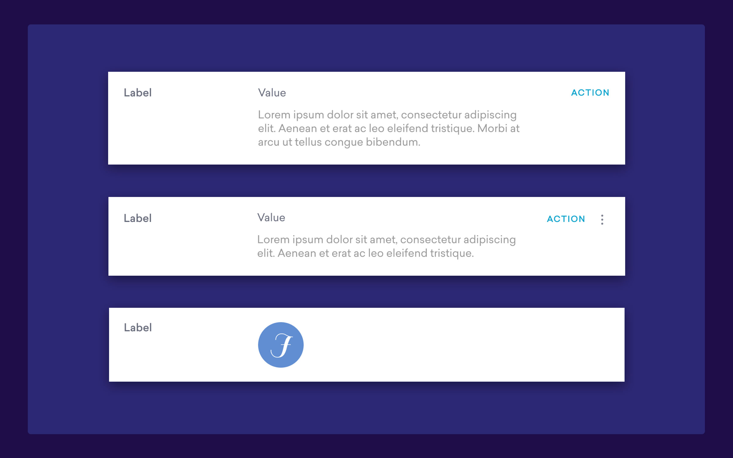
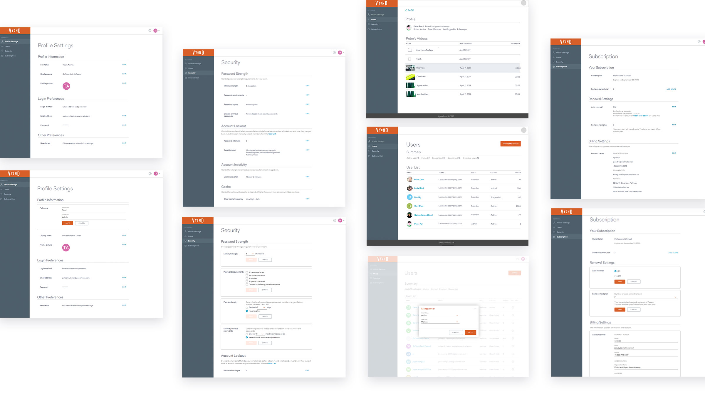
REUSABLE COMPONENTS
I began to define components and push them to the UI library for use across the Account Settings experience.
The "Settings" and "Table" were new components. I ensured that they fitted within the existing Vyond design system.
The components were broken down into the smallest reusable units. All states and interactions were defined.
On the engineering side, engineers tested out the designs in code, components were further modified based on engineers feedbacks.
SETTINGS COMPONENT - "VIEW" STATES
THE SETTINGS COMPONENT - "EDIT" STATES
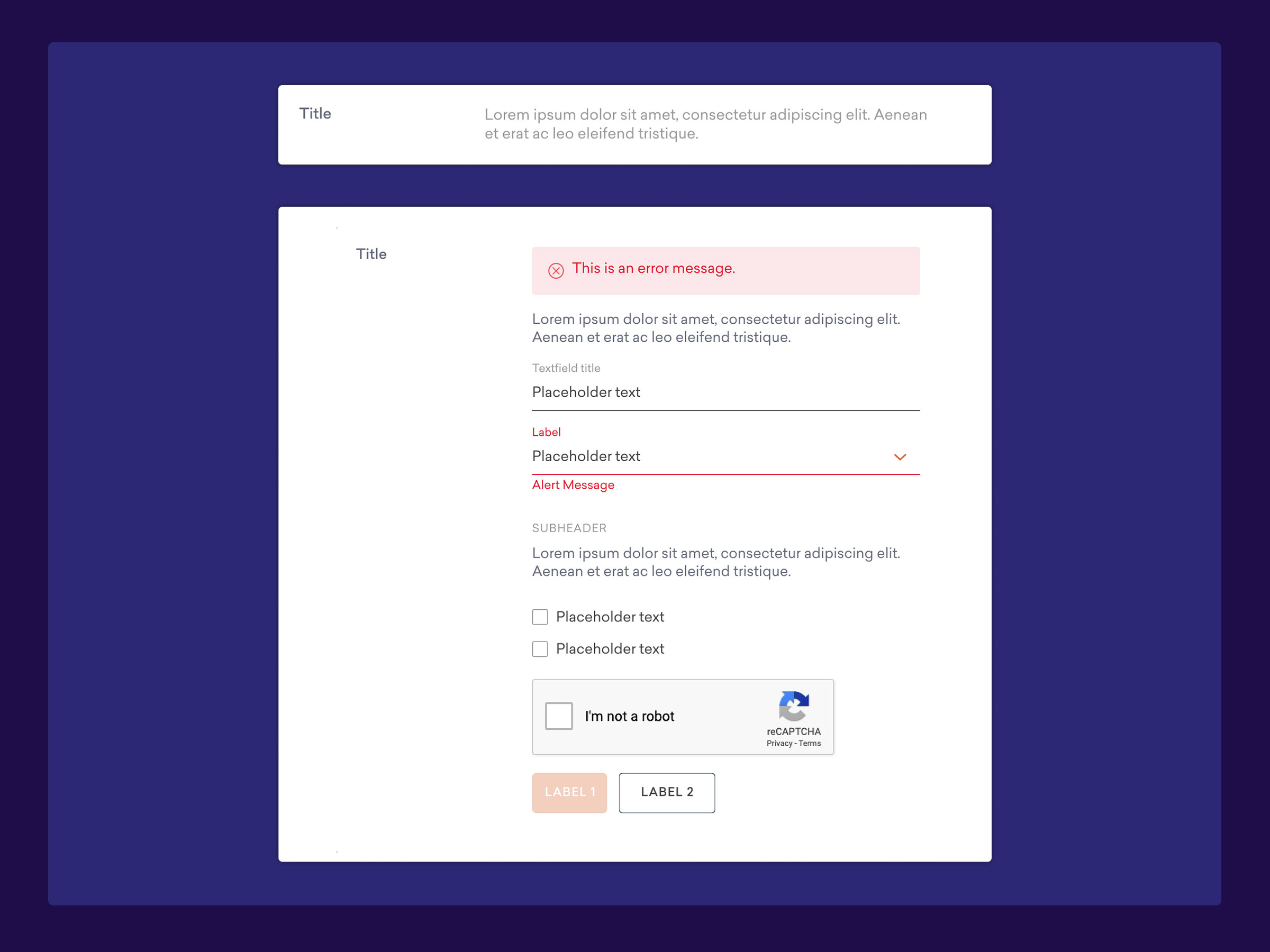
SETTINGS COMPONENT - " LOADING" STATES
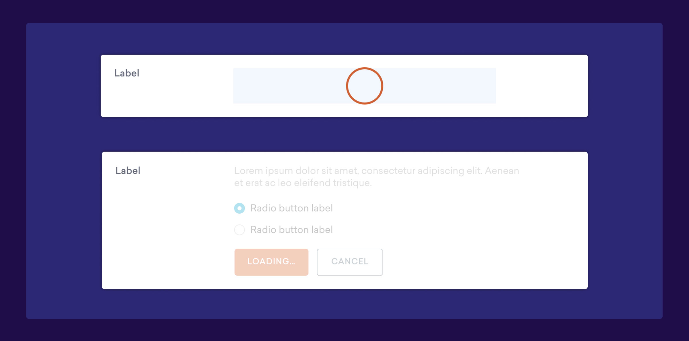
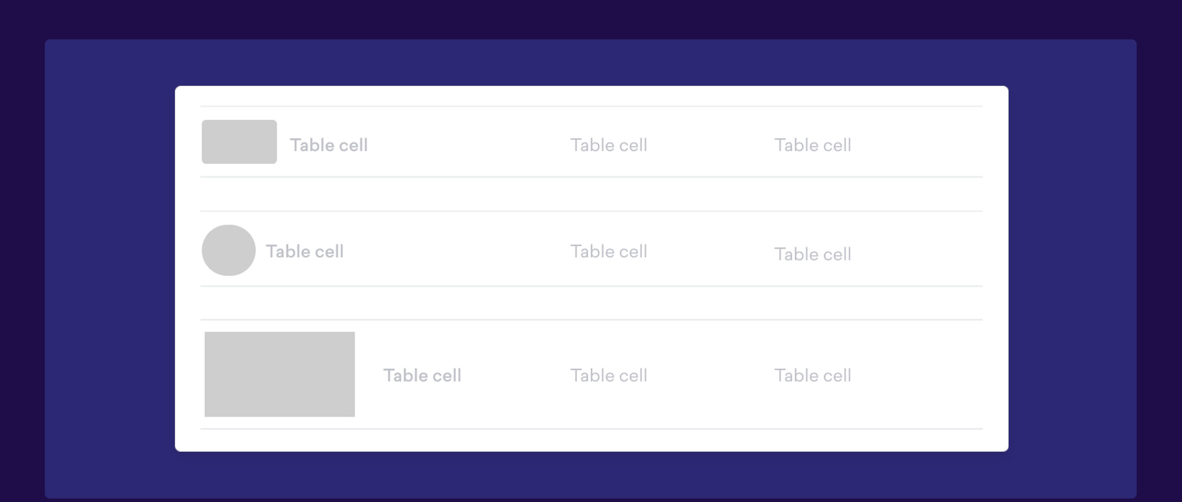
TABLE COMPONENT
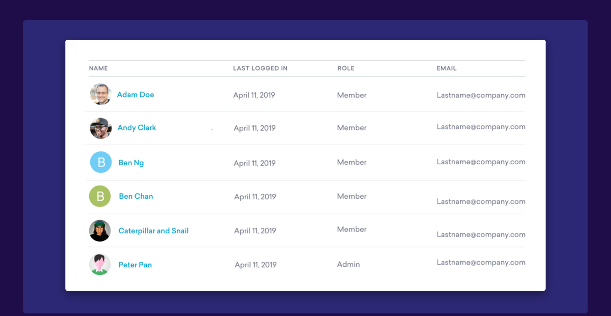
TABLE COMPONENT - HOVER STATE
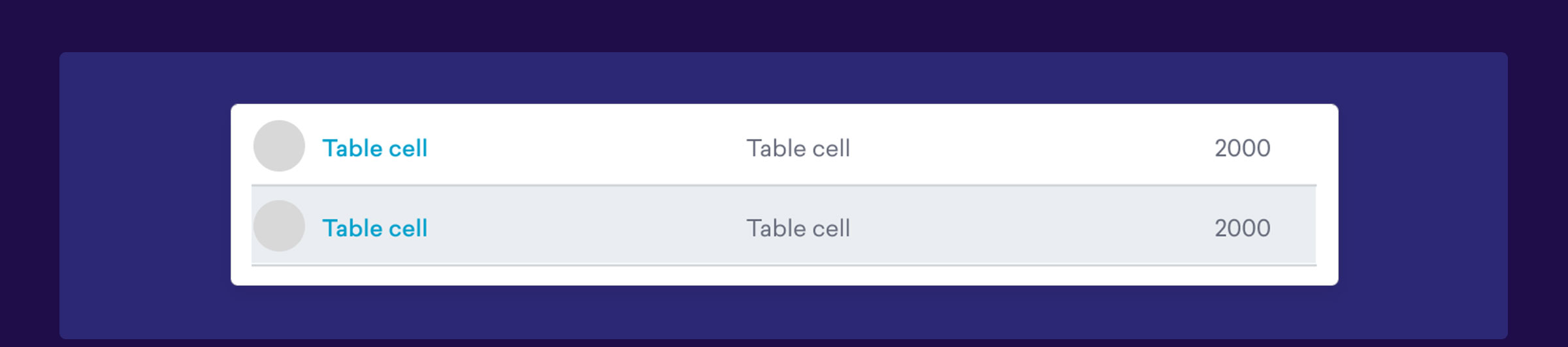
TABLE COMPONENT - LOADING STATES
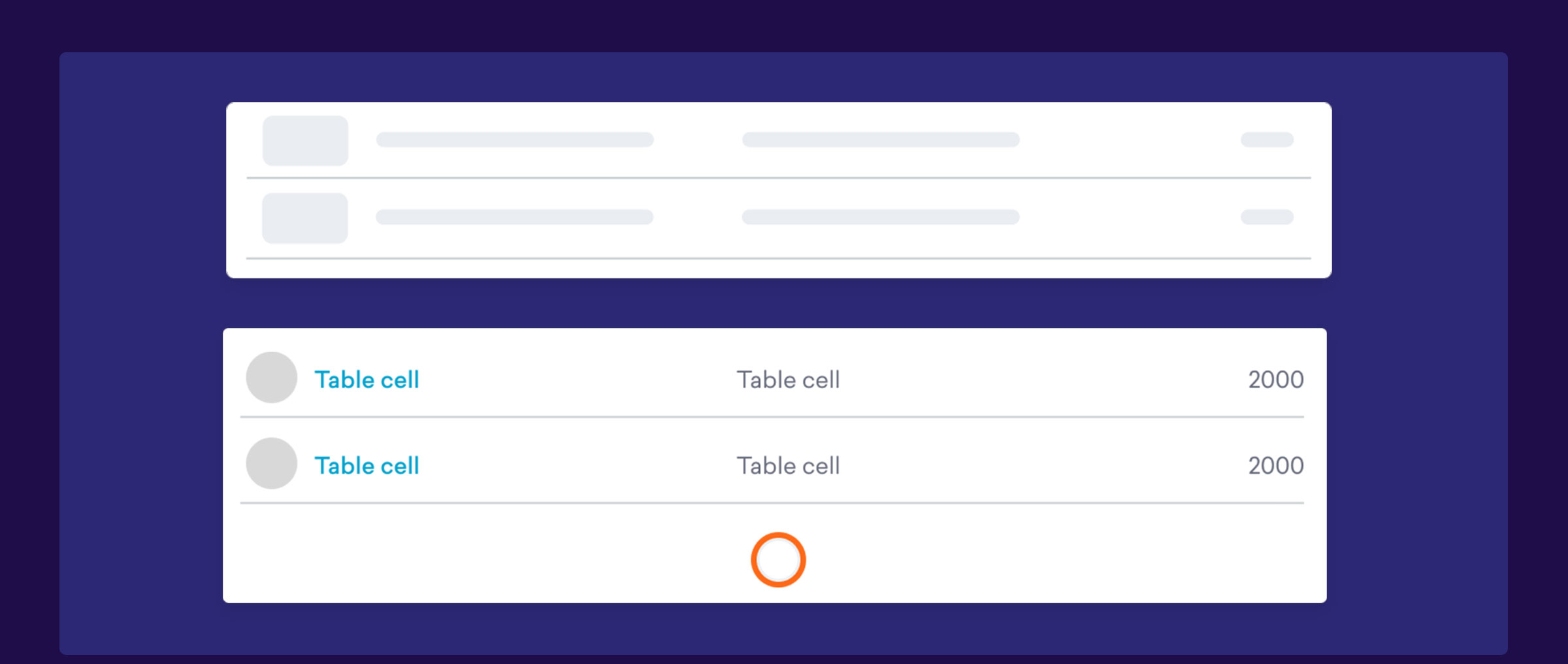
TABLE COMPONENT - TABLE THUMBNAILS OF DIFFERENT SIZES
SETTING DESIGNS USING STANDARDIZED UI COMPONENTS
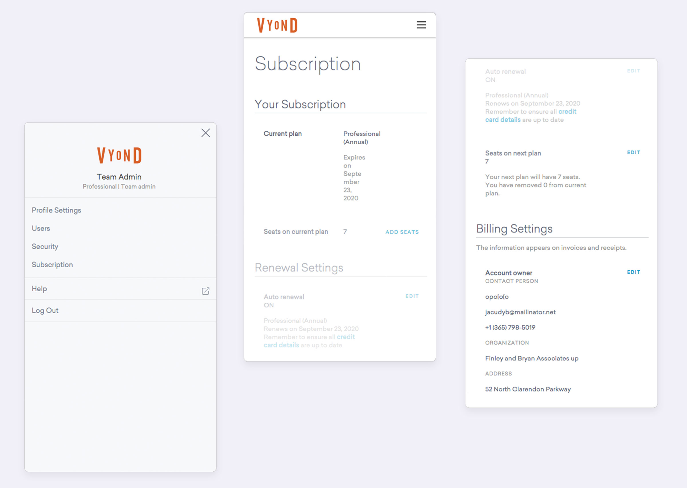
Responsive
Learnings
01 THE IMPORTANCE OF A DESIGN SYSTEM
The Setting pages had numerous features. There were lots of tables, form inputs, dropdowns, buttons, notifications etc. With a set of reusable UI components, UX designers could quickly create prototype and propose different solutions.
In the end, we were able to come up with a scalable architecture for the Settings design.
02 THE BENEFITS OF AN AGILE PROCESS
In this project, we adopted a more agile approach in product development. We hosted weekly team meetings to review the design process, where everyone including the product owner, engineers, UX designer and copywriter wwere brought in to review the UX directions and UI components for the project. The engineering team was very agile and cooperative in testing out the components.
This was important because we got to validate and test the designs at an early stage with engineers. I have learned that It helped to implement the design system to the product from the beginning and made it part of the workflow.
03 TEST EARLY AND SEE HOW IT GOES
What I have learned is that being a designer means being resilient and open to changes.
There were times when engineers pushed back against our design. For instance, for the responsive data table, at first, I wanted to transform the table into a "Card" view, but after discussions with the engineers and considering the time and technology required, we decided to go with simple horizontal scrolling - a more straightforward and MVP approach.
This was a bit hard to accept at first, as a user experience designer, I wanted to create an optimal experience, but then I have learned to focus on what really adds value to the user and the business. I have learned to let go of the obsessions for perfection.