Visual Design
Balance usefulness with aesthetics, make sure visual design is in the service of user experience
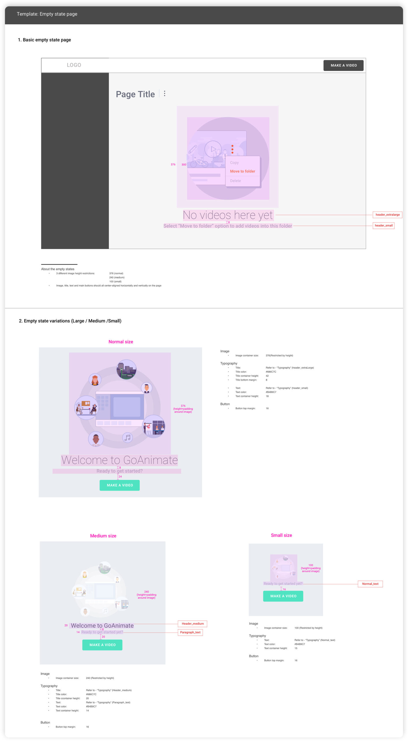
Team Onboarding Graphics
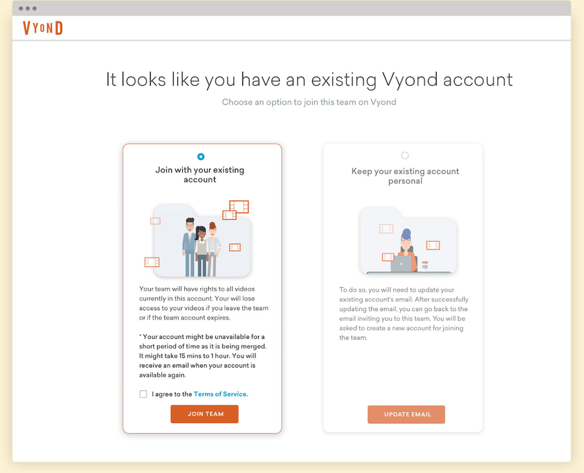
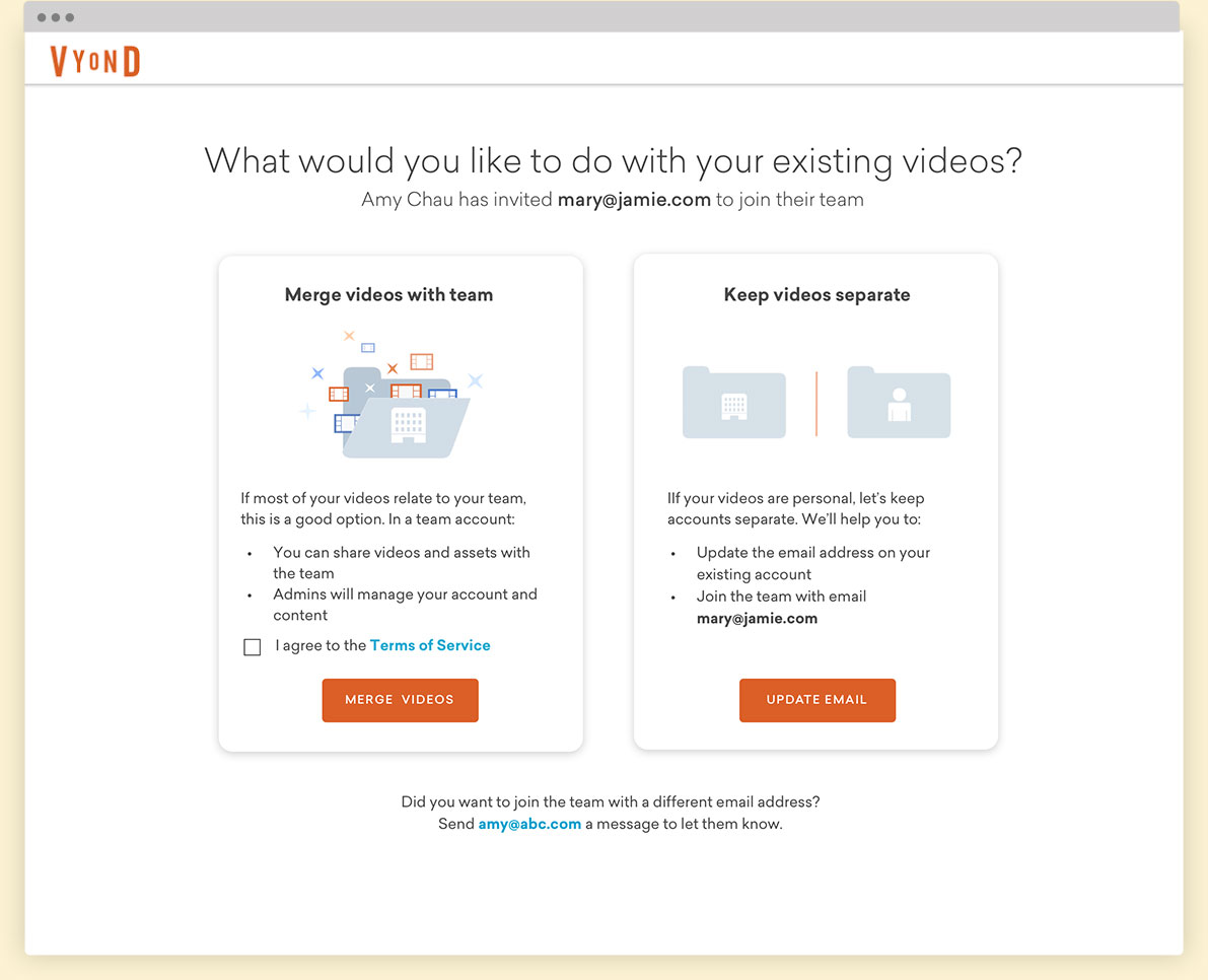
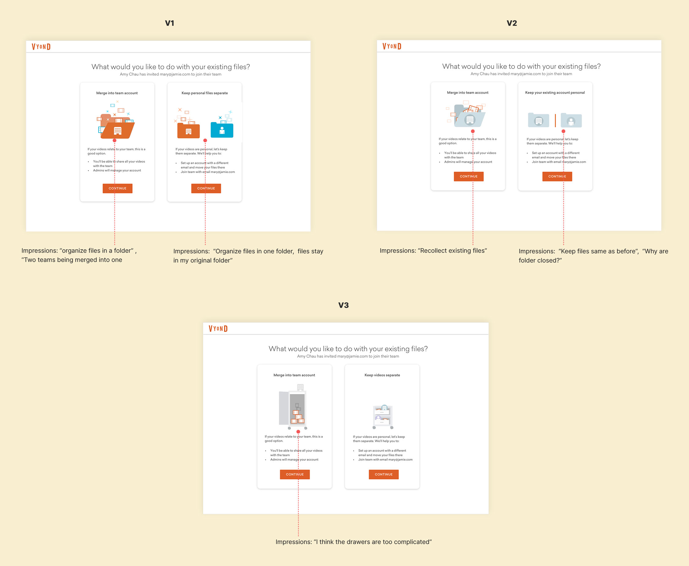
When the team members joined the GoTeam, they were sent to a "Merge Account" page. Through testing, we learned that this page looked confusing, users did not understand the "Merge" VS "Keep Existing" account options. We tried to solve this problem by fine-tuning the visuals.
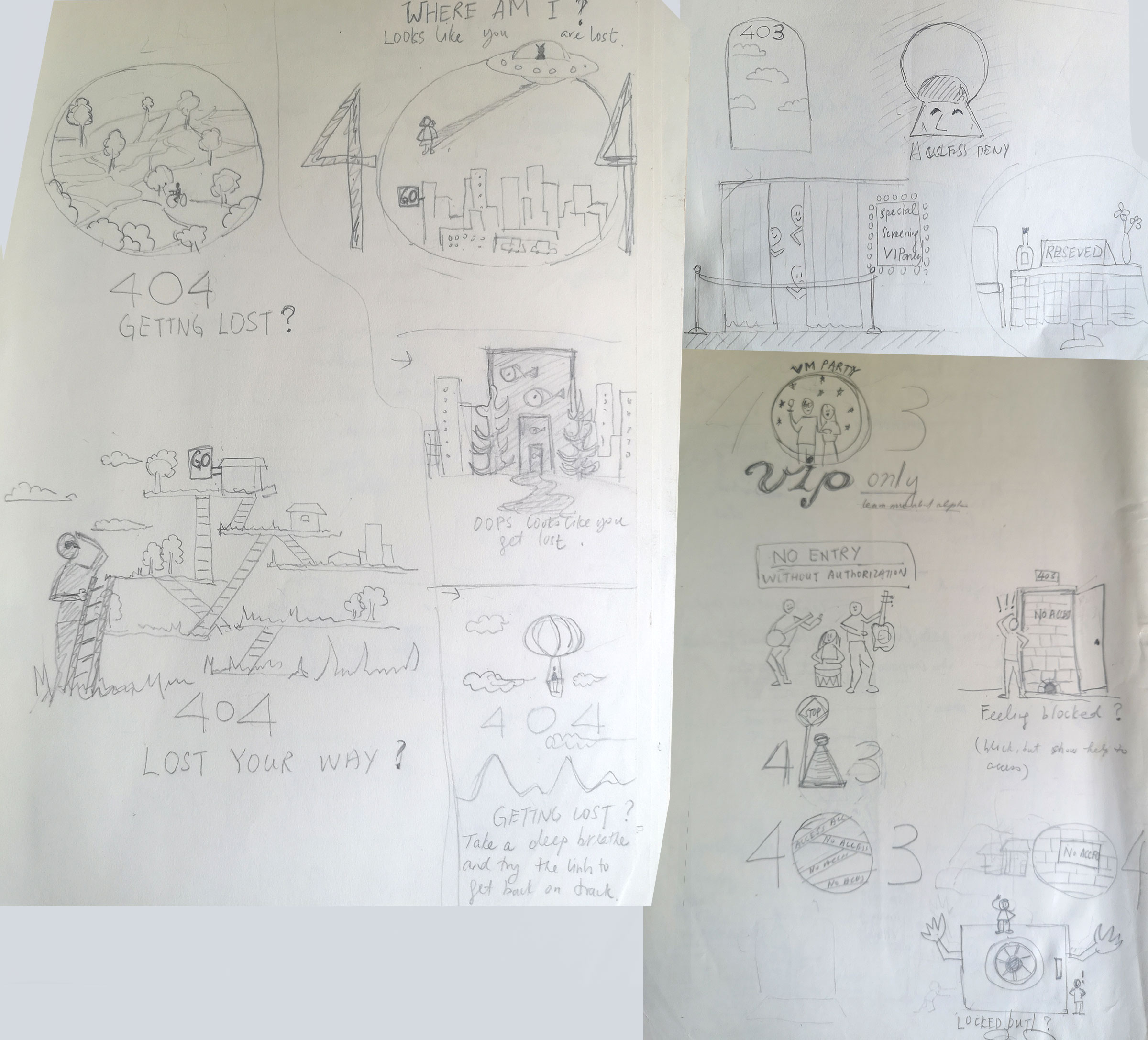
ITERATIONS
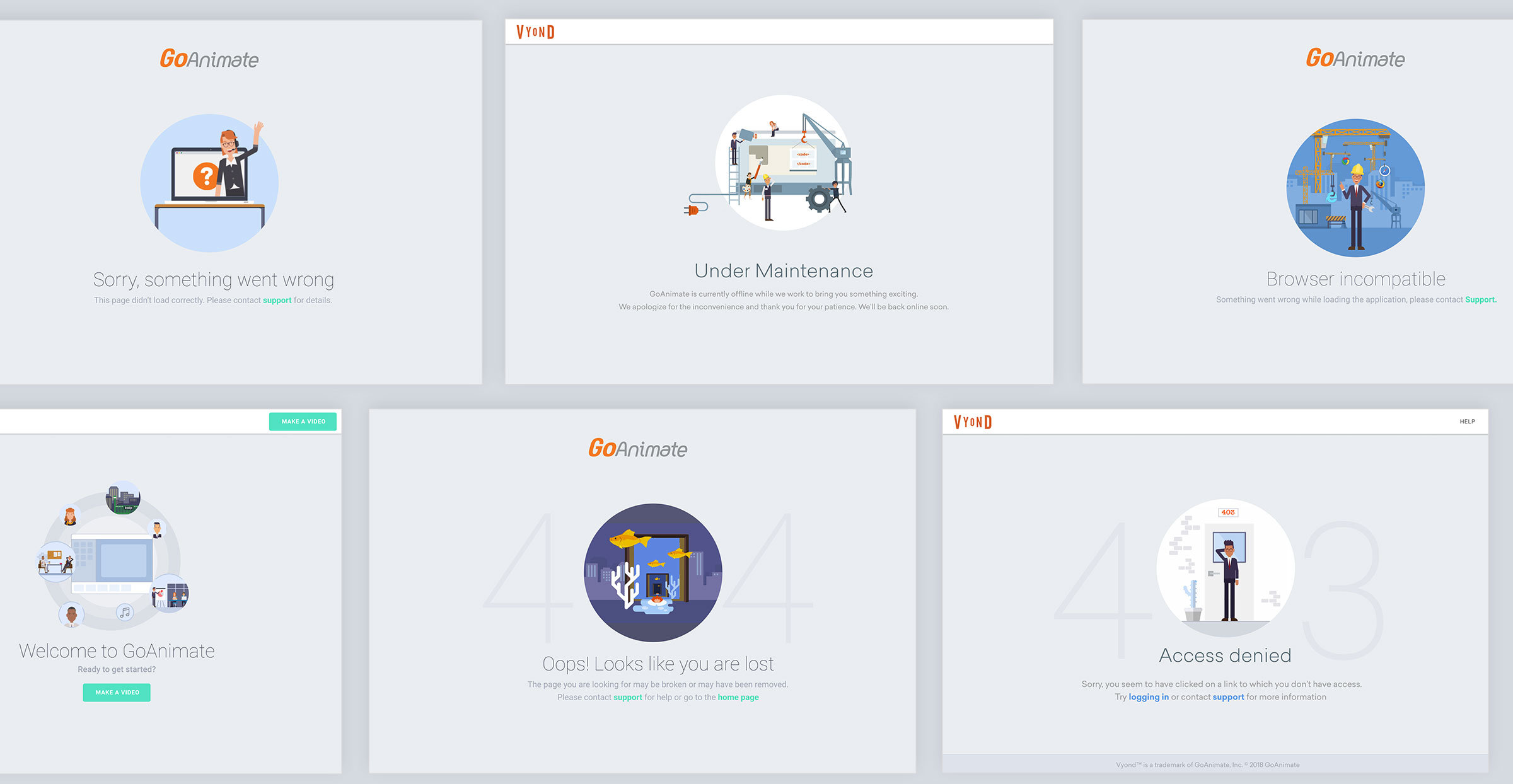
Web App Illustrations
A series of illustrations were created using Vyond's assets and characters. I applied Vyond's color palettes to the illustrations to reflect the brand. They were designed to educate the users and guide them on what to do next.
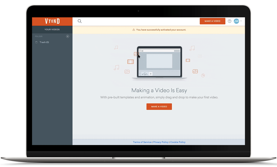
Onboarding Animation
Subtle animation was created to prompt users to start making videos, while not being too distracting.
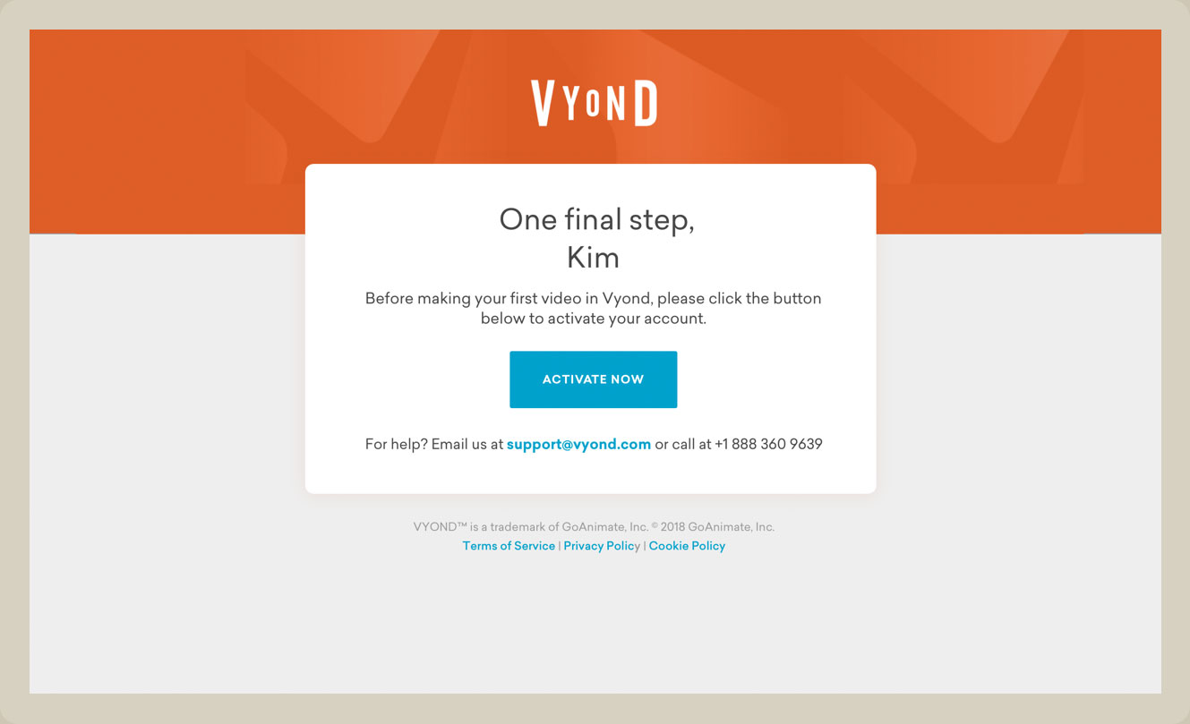
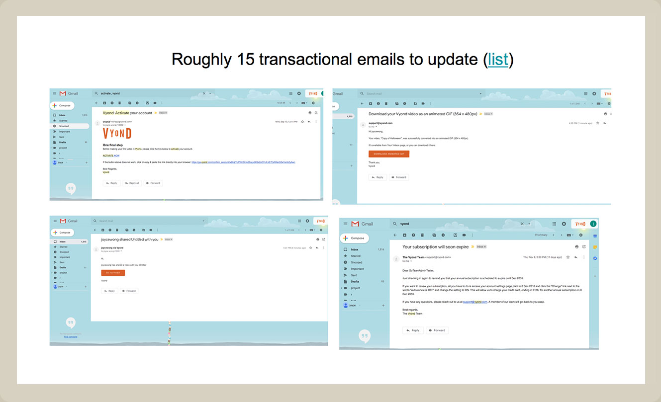
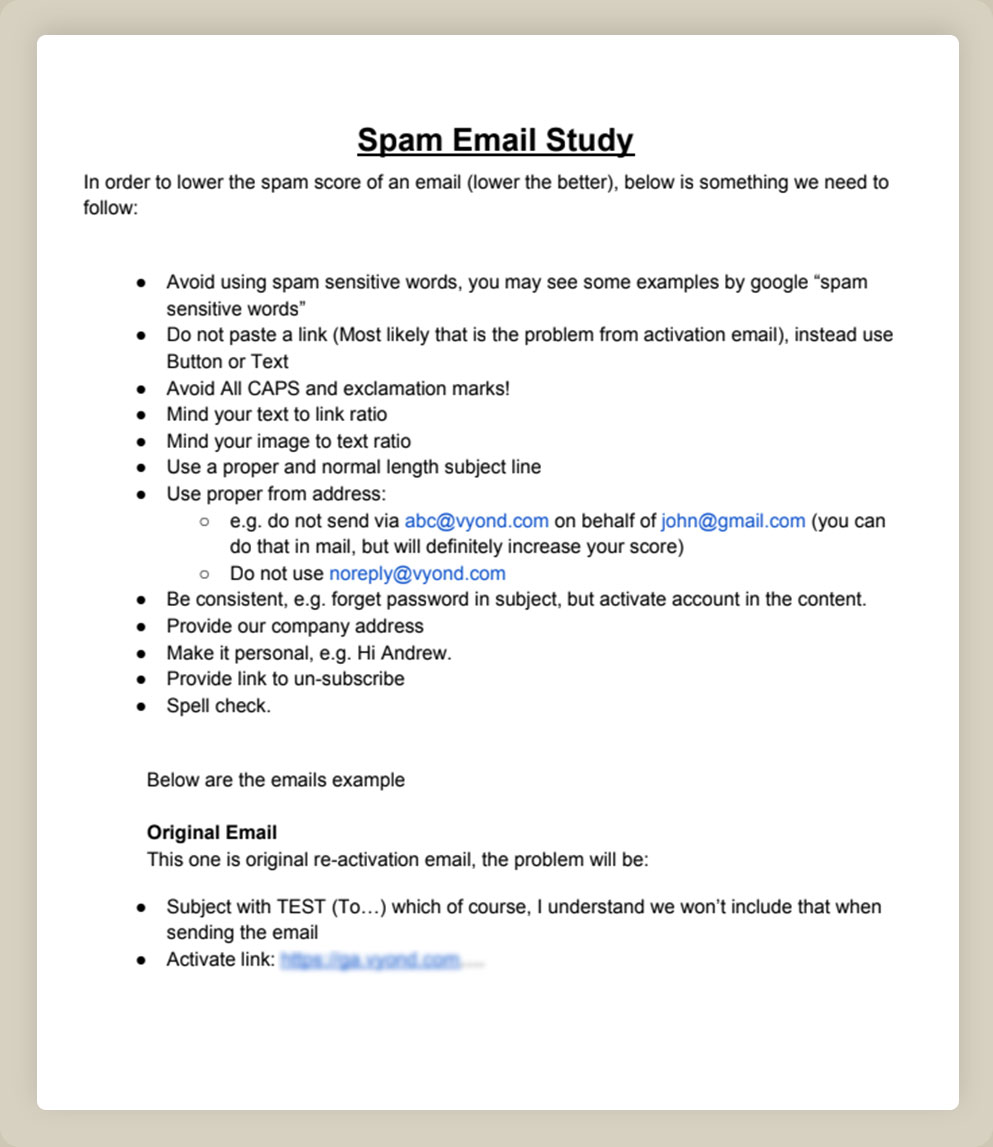
Email Template Design
The original emails had no design at all. It was in plain text and came with different versions. I did a content audit, studied the current email trend, and redesigned an email template that standardized all transactional emails.
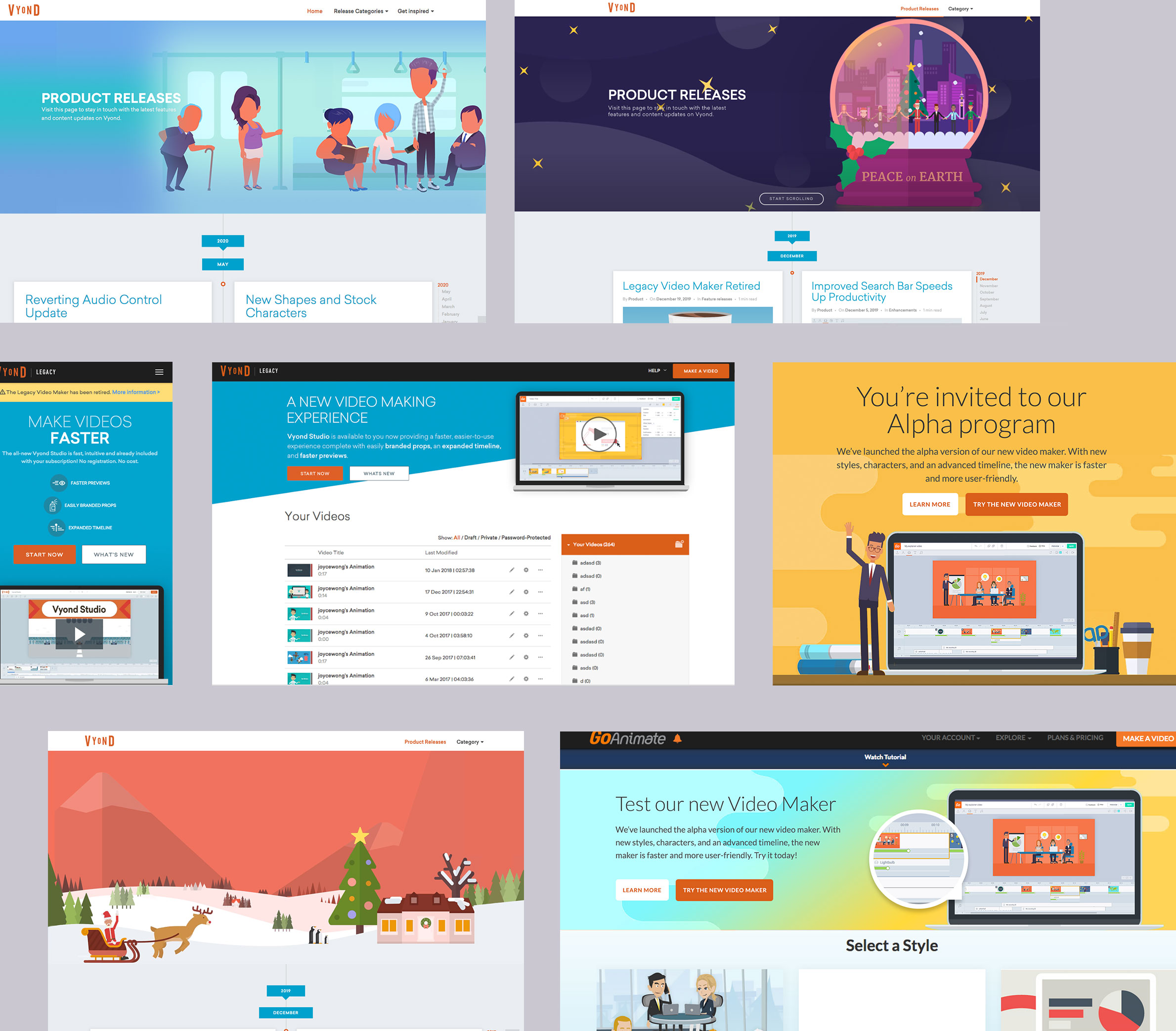
Promotional Banners
I was also responsible for creating banners on the company website. They needed to be both creative and comply with the company's diversity guidelines. I made sure characters of different ethnicities, body shapes, skin tones, ages, and genders were well represented in the banner design.