Video Pages Redesign
How might we help the users to find, share and organize their videos more easily?
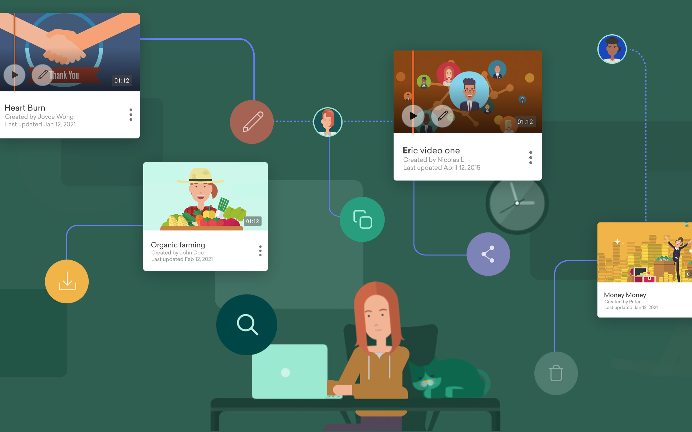
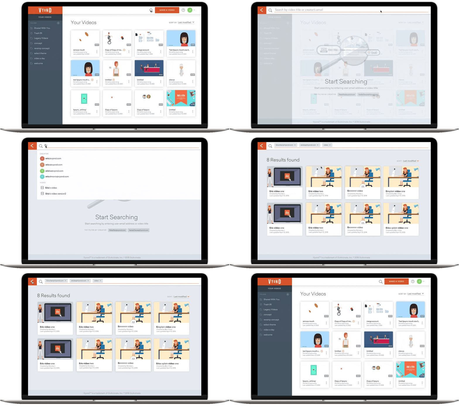

As part of the rebrand of Vyond.com from GoAnimate.com, the product team had to replace it’s existing video listing page and video player page. Collaborating with a UX designer, Rohini Kolhar, we toke this opportunity to improve the video pages experience.
TEAM
Head of Design
Product Owner
UI Designer
UX Designer
Engineers
RESPONSIBILITIES
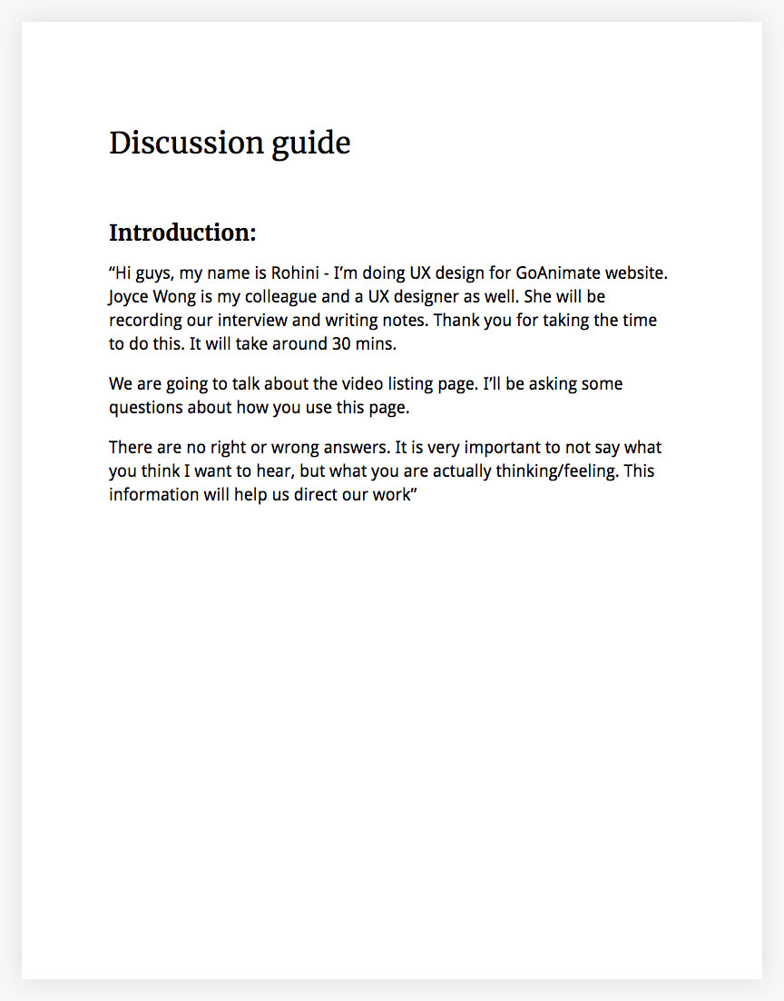
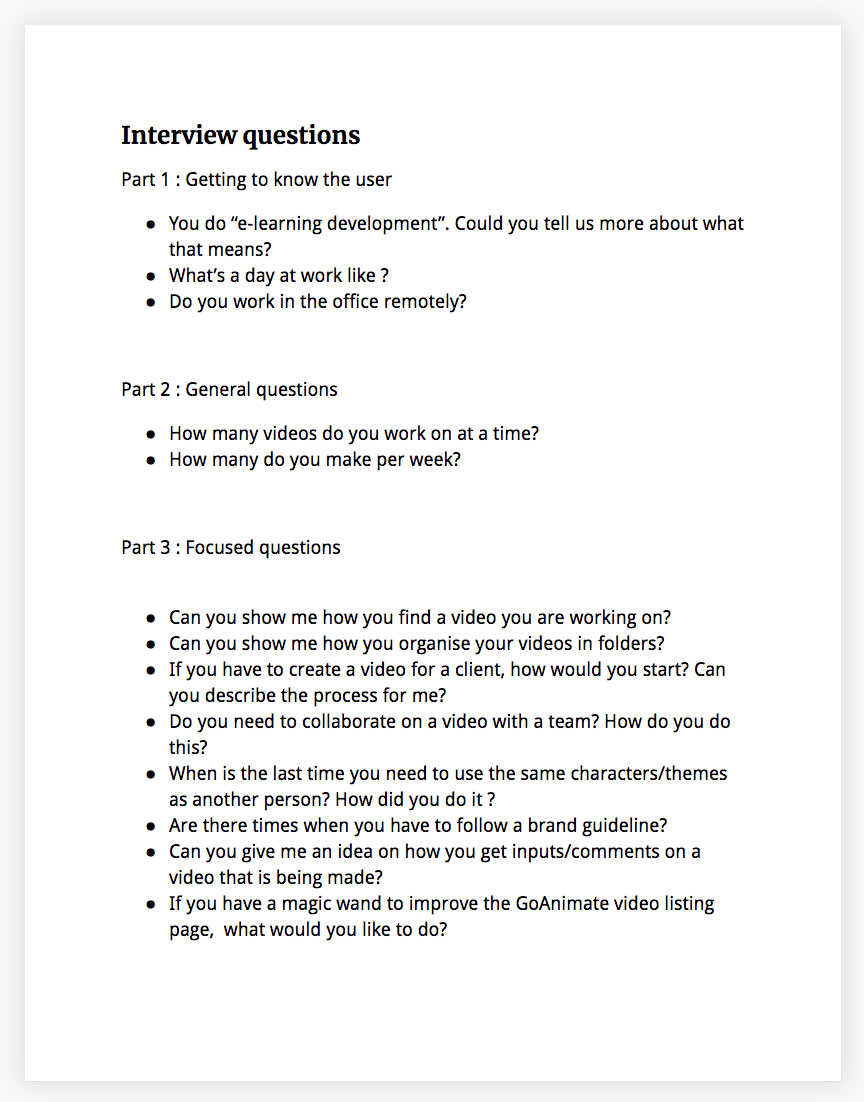
User research
User interview
Competitor research
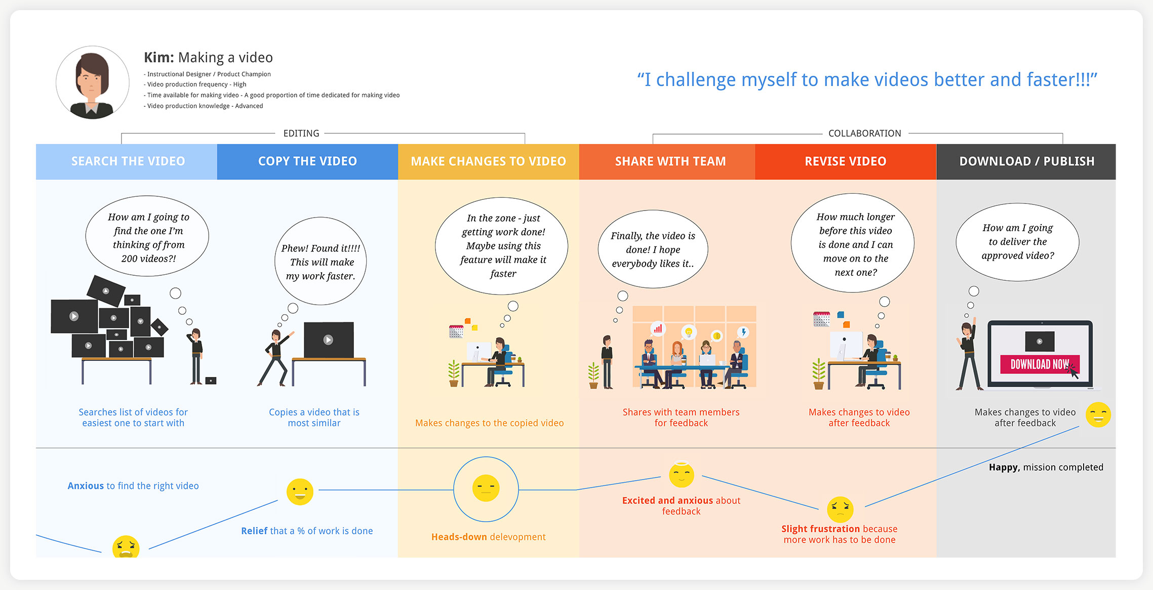
User journey map
UI design
Prototyping
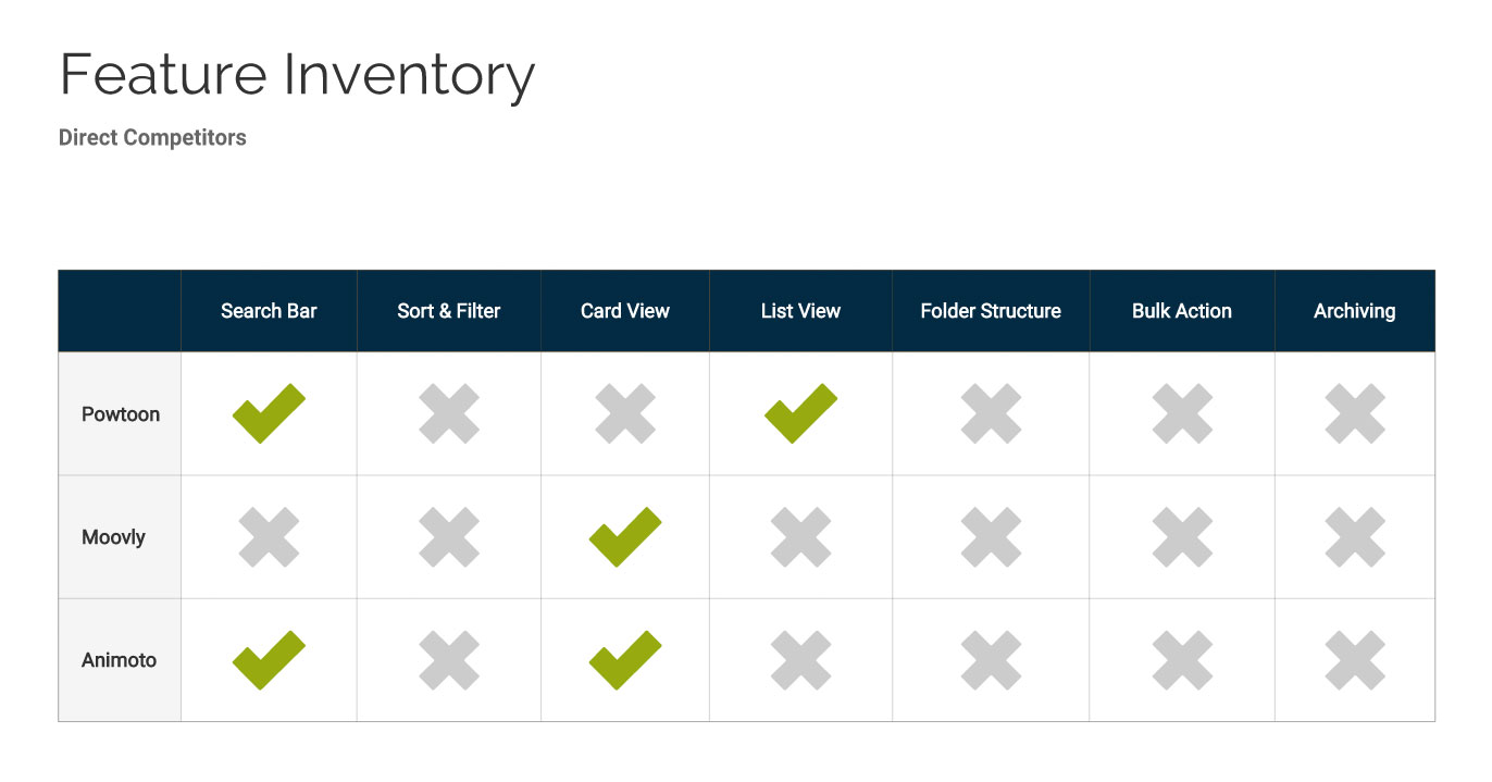
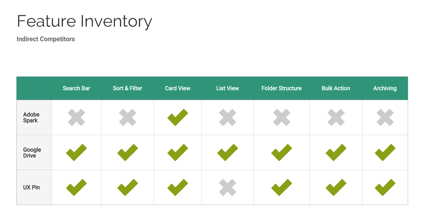
Competitor Analysis
We analysised Vyond’s direct competitors, such as Powtoons, Moovly and Animoto to discover their strength and weaknesses; Besides, I performed an analysis on UXpin, Google Drive, Adobe Spark which were indirect competitors of Vyond.
INSIGHTS
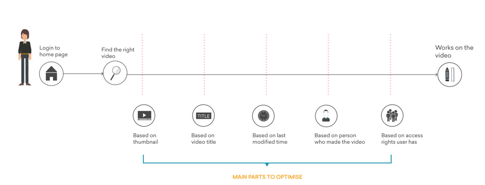
From the analysis we learned that our competitors did not put many resources on their video pages. This might be an opportunity for us if we could improve the page usability and help users to better prepare and plan their workflow before they started making videos.
Insights
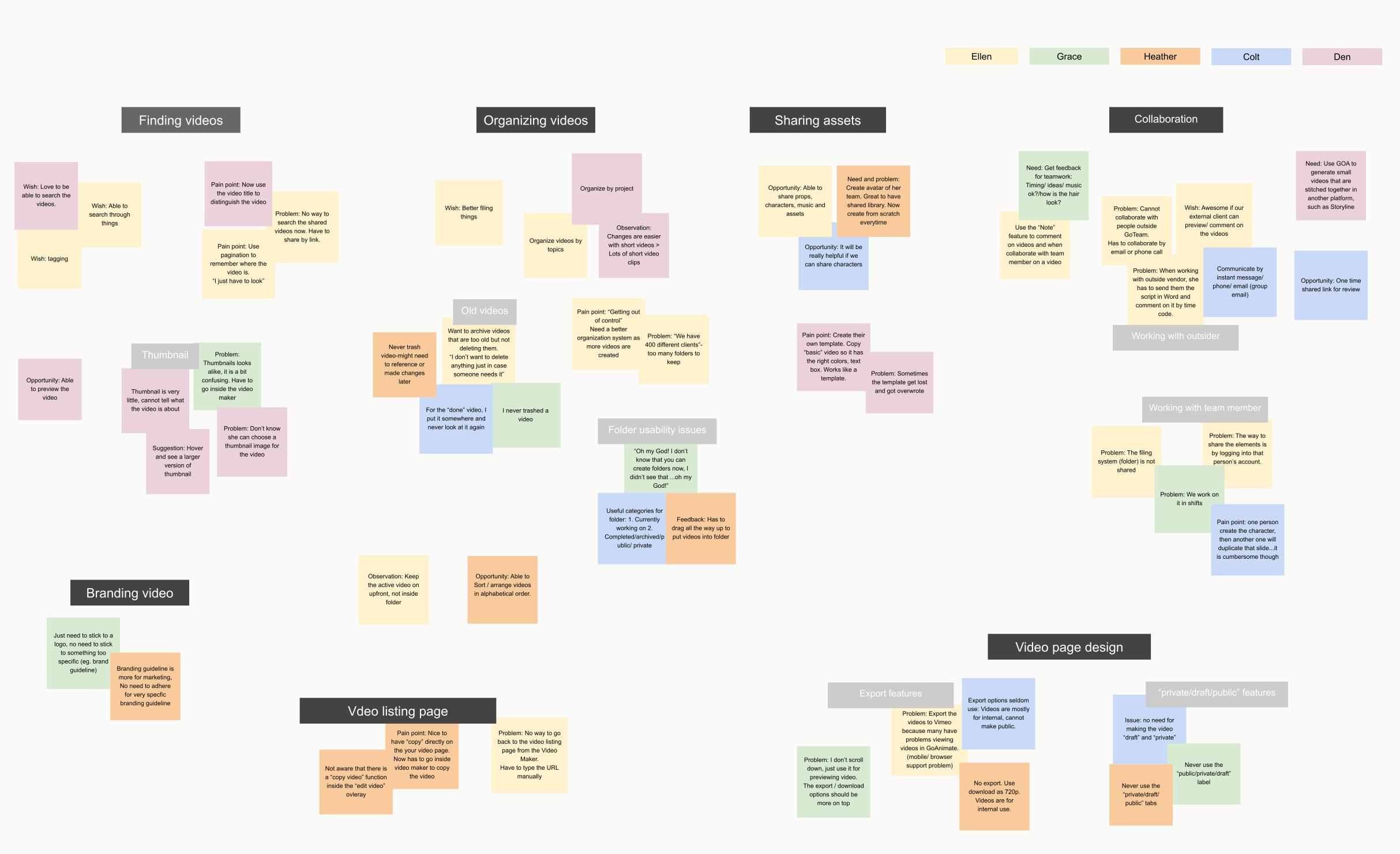
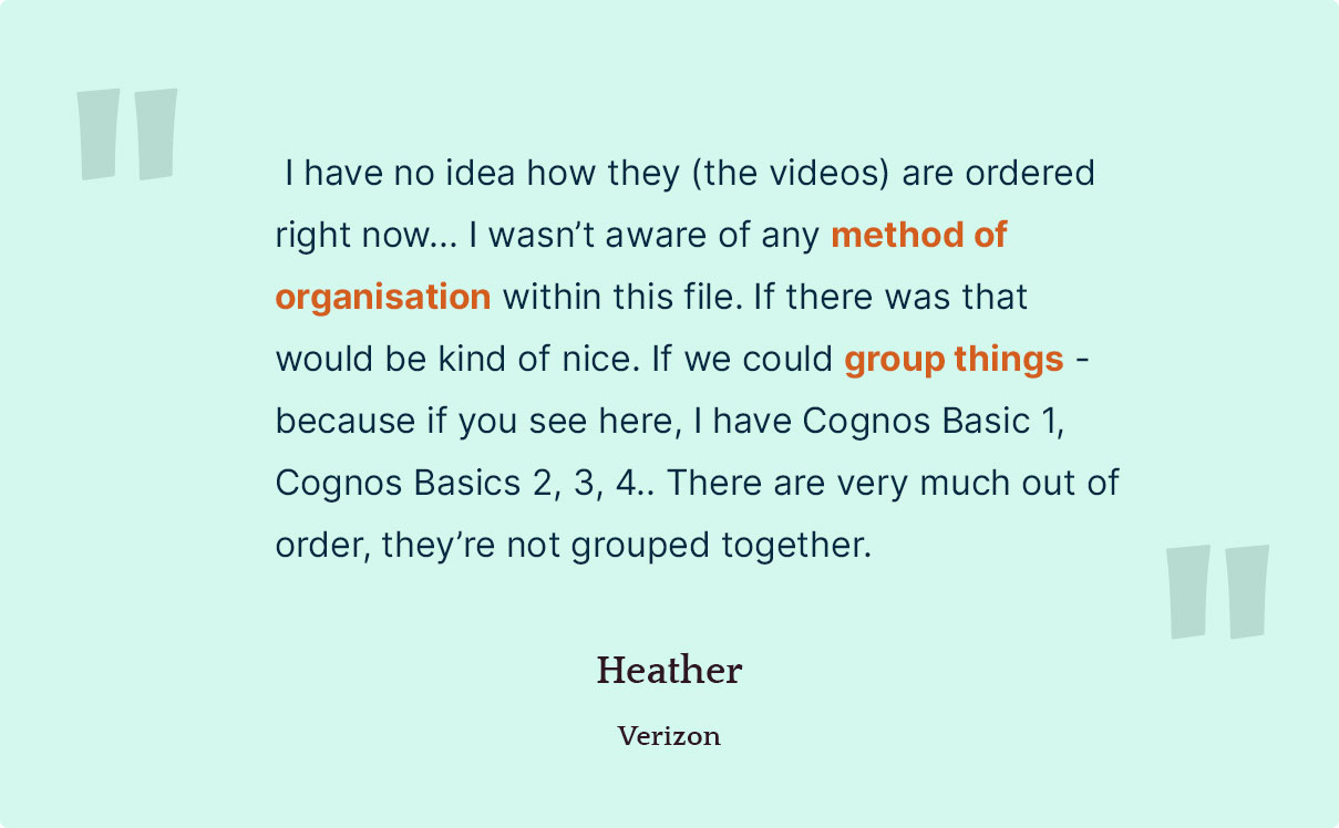
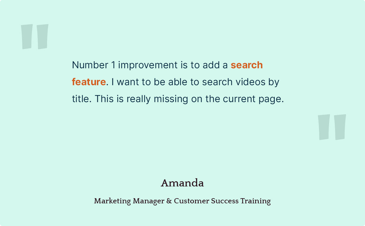
Trends and patterns emerged from the user interviews, we identified many user needs and pain points:
FINDING VIDEOS
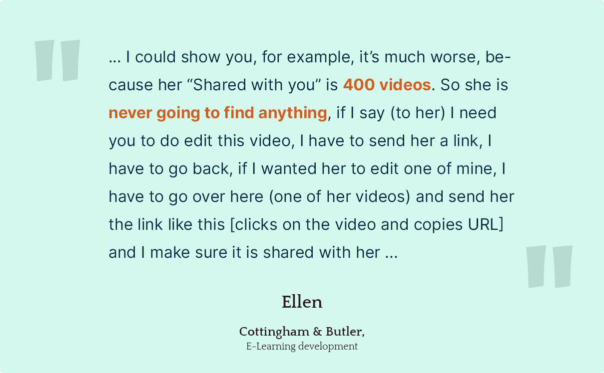
- Users had problems finding and sharing videos with coworkers.
- Users seldom created videos from scratch. They created new videos by copying old videos.
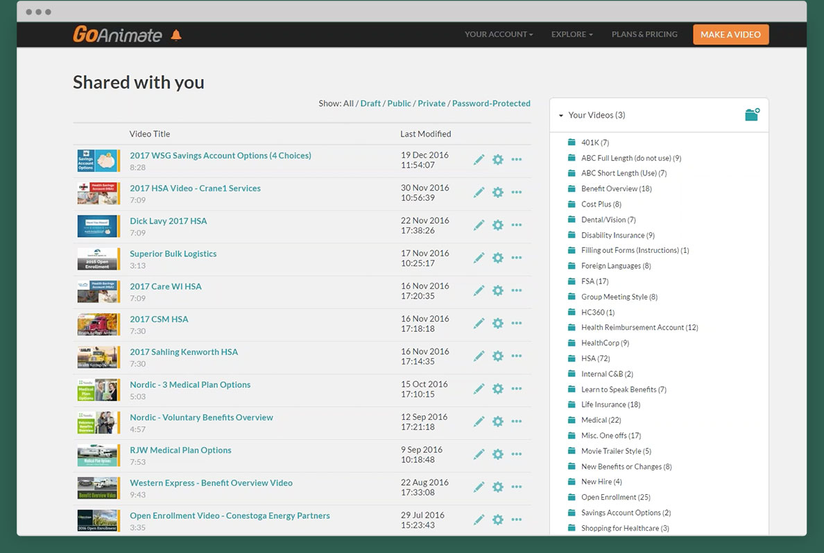
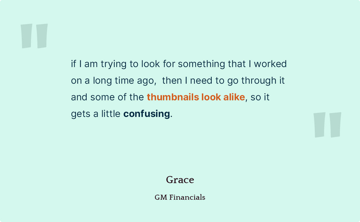
- Thumbnail were too small. They looked the same when users created videos with the same opening scene.
CAPABILITIES TO SHARE
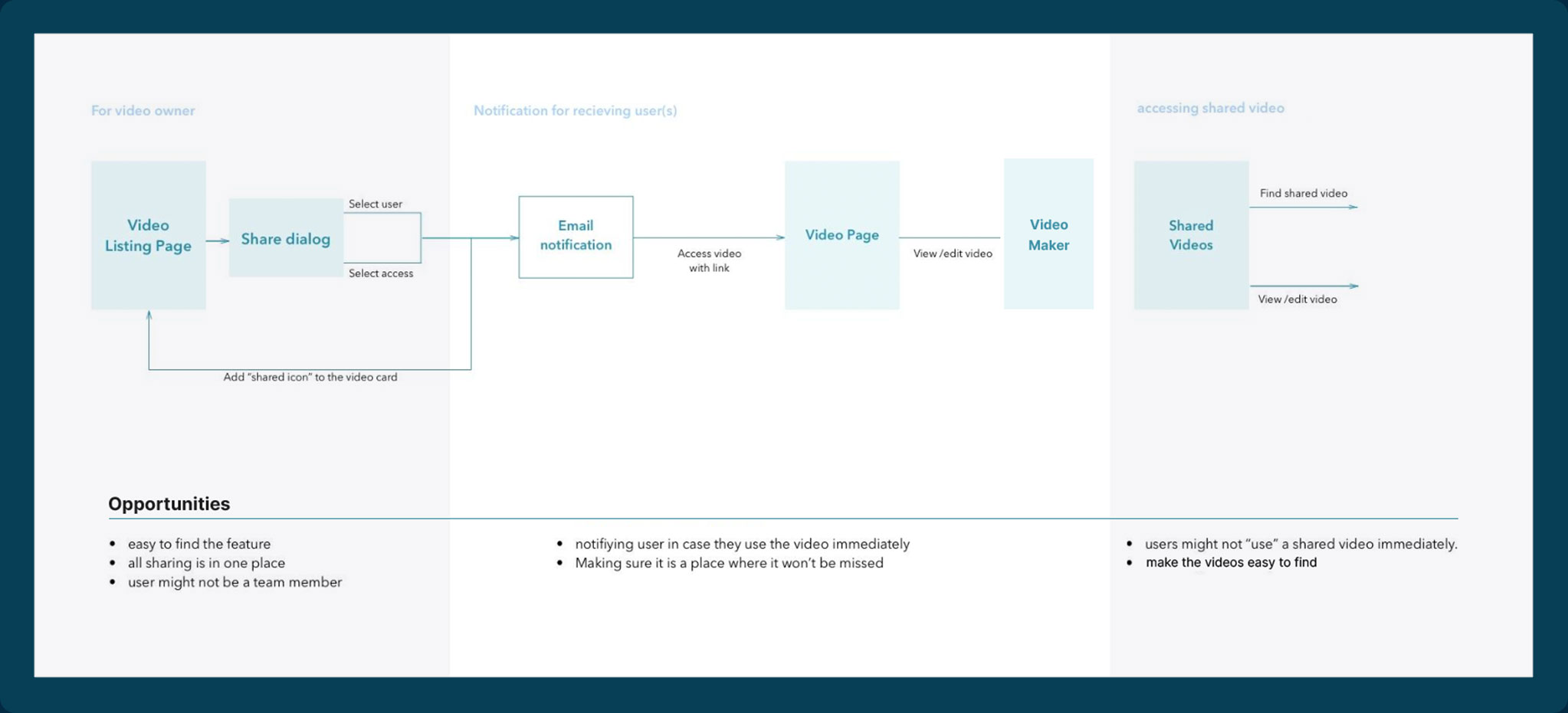
- It felt complicated to share videos with coworkers
ORGANIZING VIDEOS
- Users wanted to separate new videos and "done" videos.
- Able to bulk delete videos.
EASE OF USE
- Users did not know that they could drag and drop videos to the folder list on the right.
- They thought dragging the item and then scrolling it all the way back up to the folder list on the right was painful.
- The “Copy” button needed to be more prominent. Now it is hidden under “ …"
Find & View Videos Easily
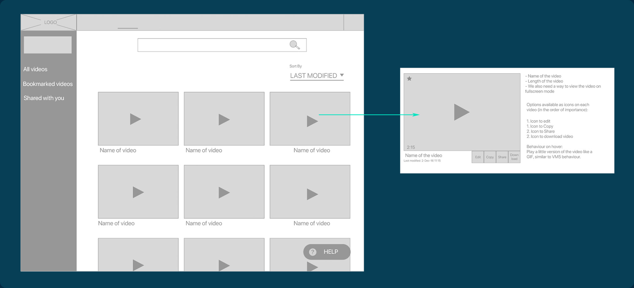
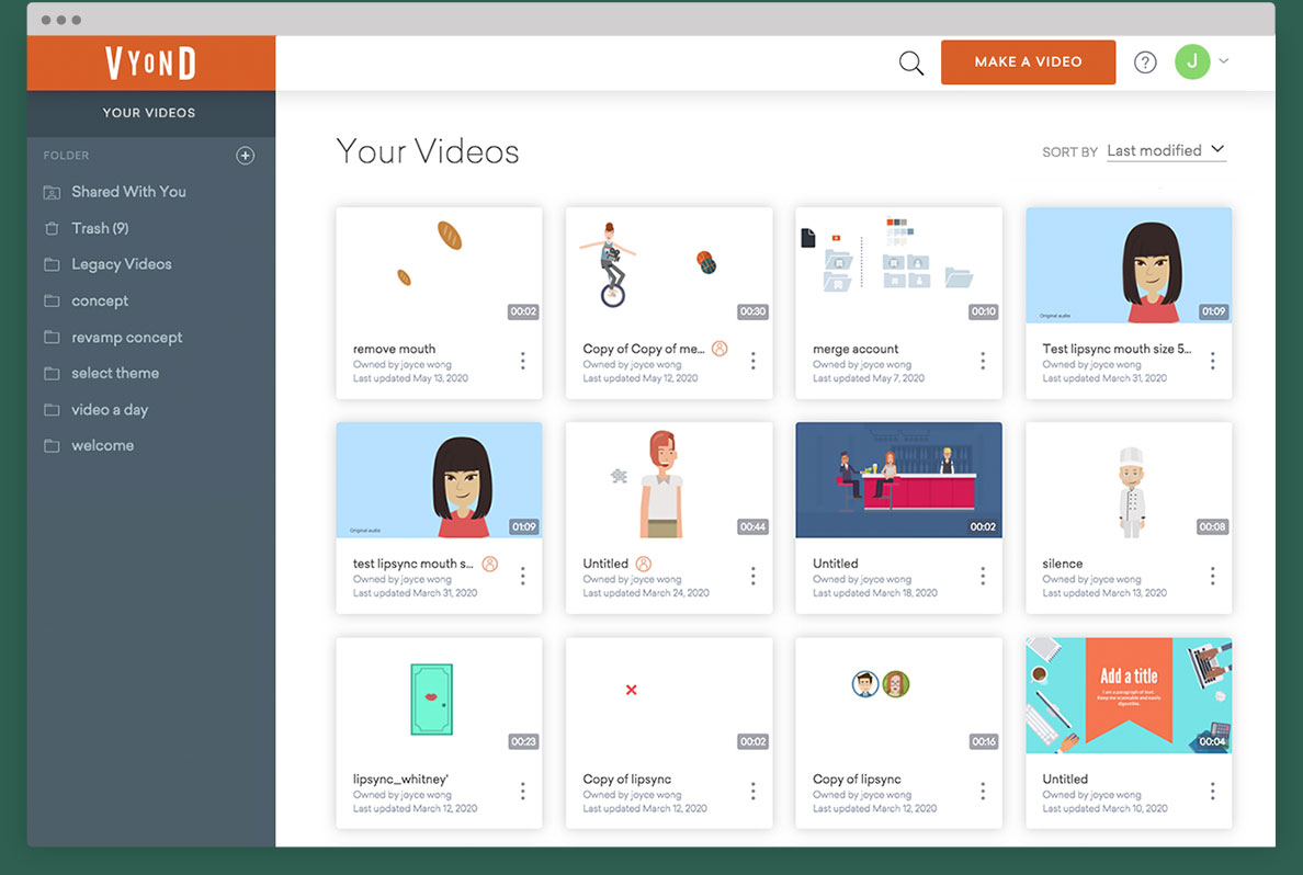
We went through several rounds of ideating for the video page designs. Using feedbacks from the management and development team, we were able to narrow down and created more finished mockups.
Search Bar
HIDING COMPLEXITY
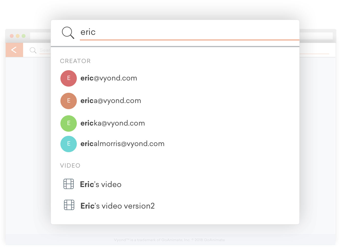
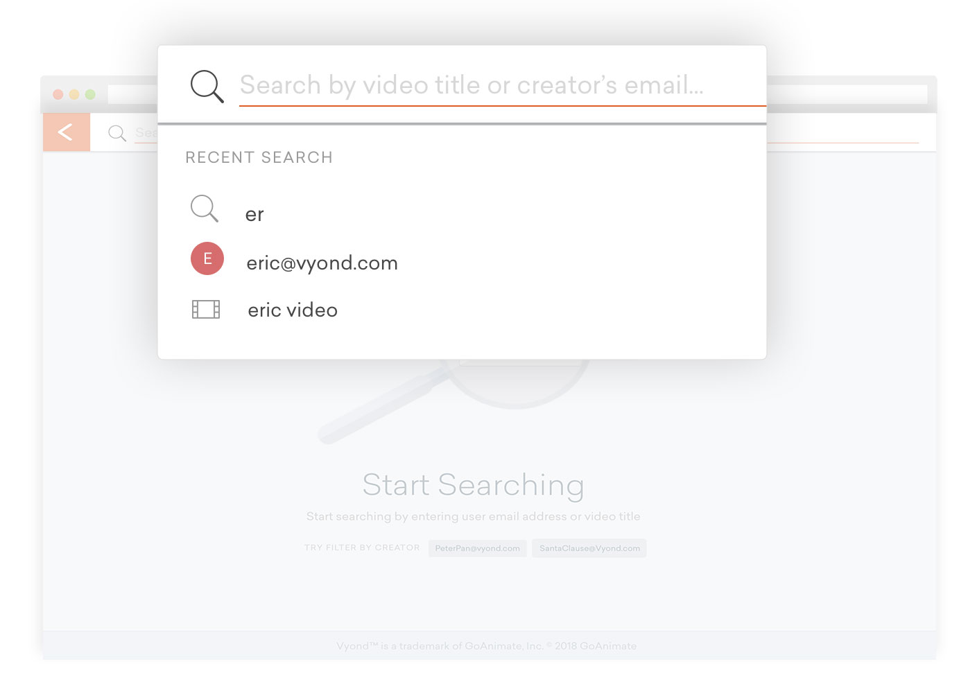
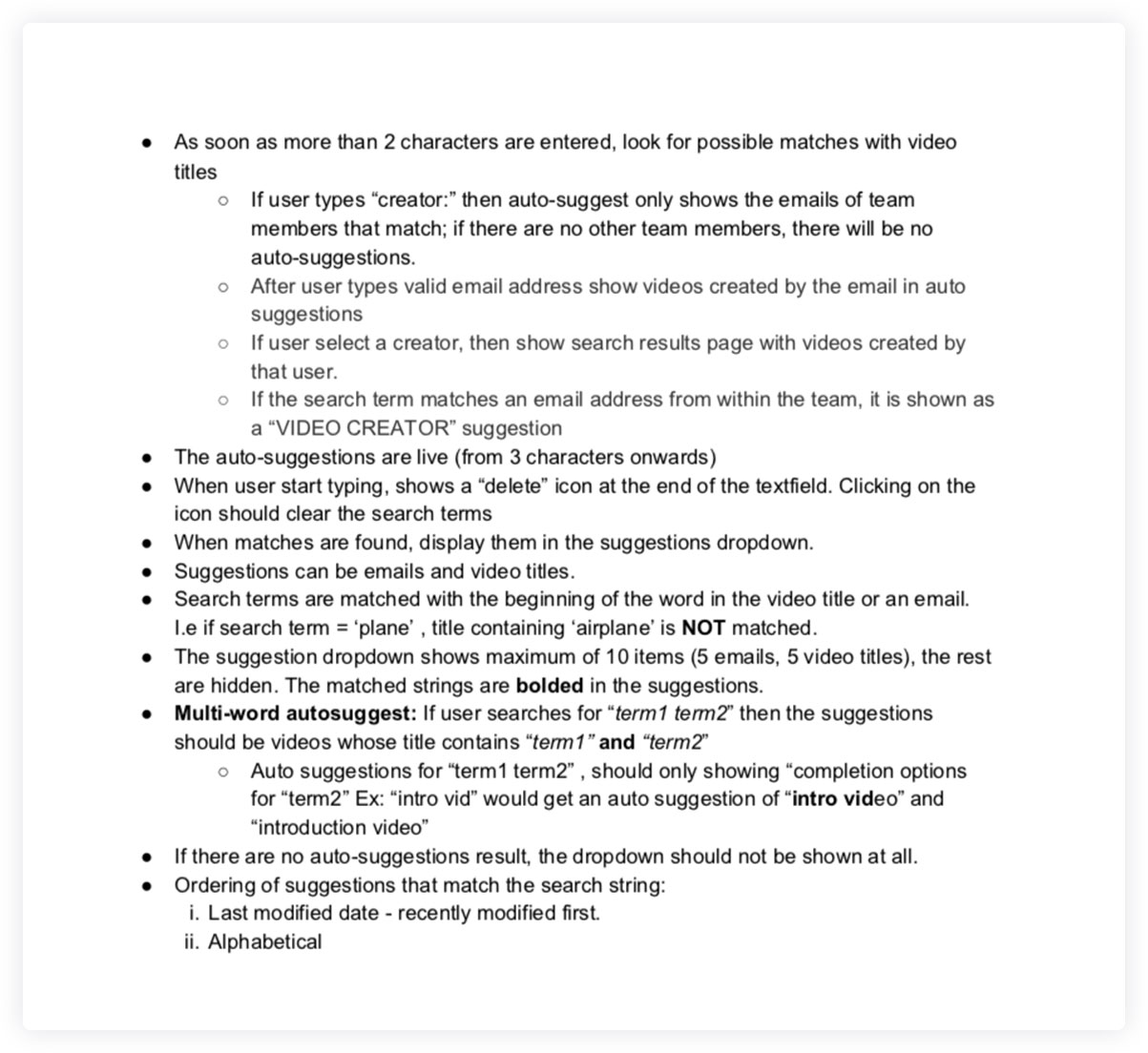
Rather than having the search bar taken up spaces on the top bar, why not displaying it first as an icon button and revealed the input box as the users clicked on it?
I displayed the “Search" icon next to the “Make a video” button, because from research, we learned that user either created a video from scratch ("Make a video" button) or by editing an old video (Search bar).
Card UI
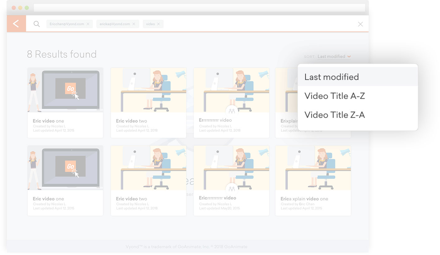
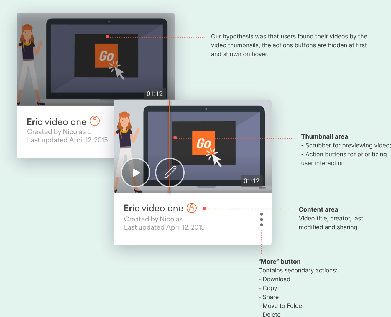
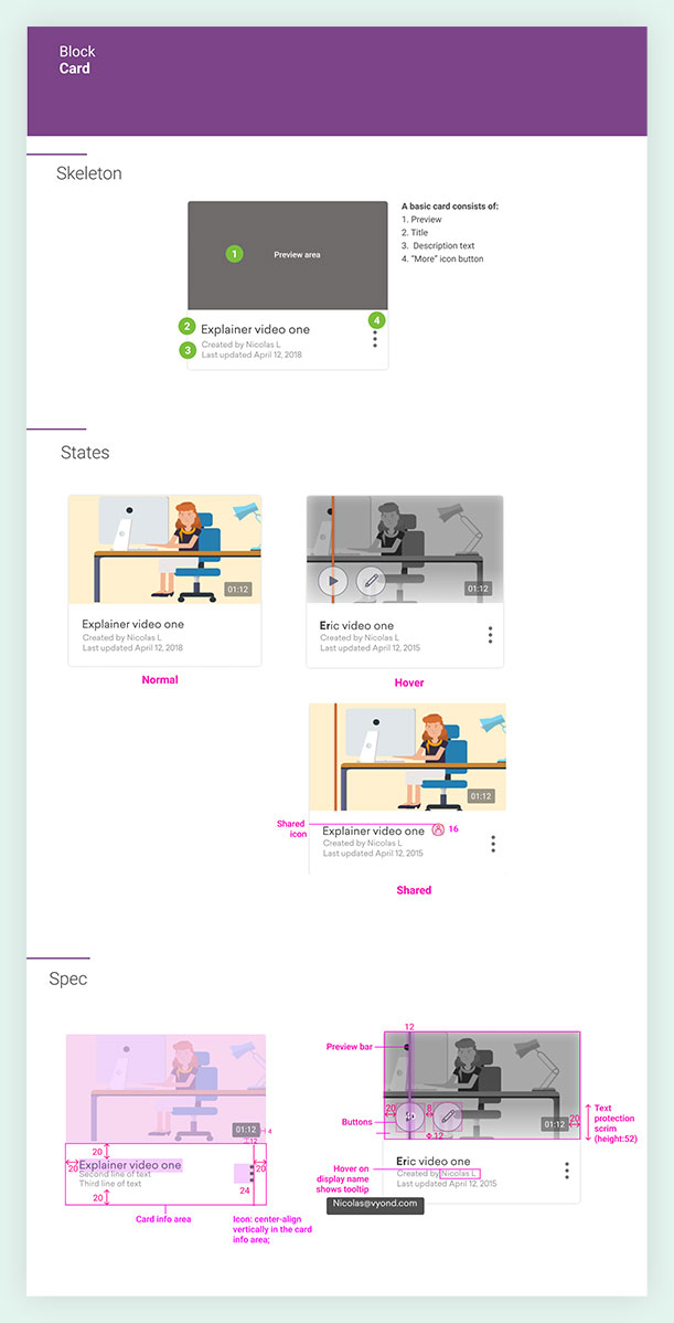
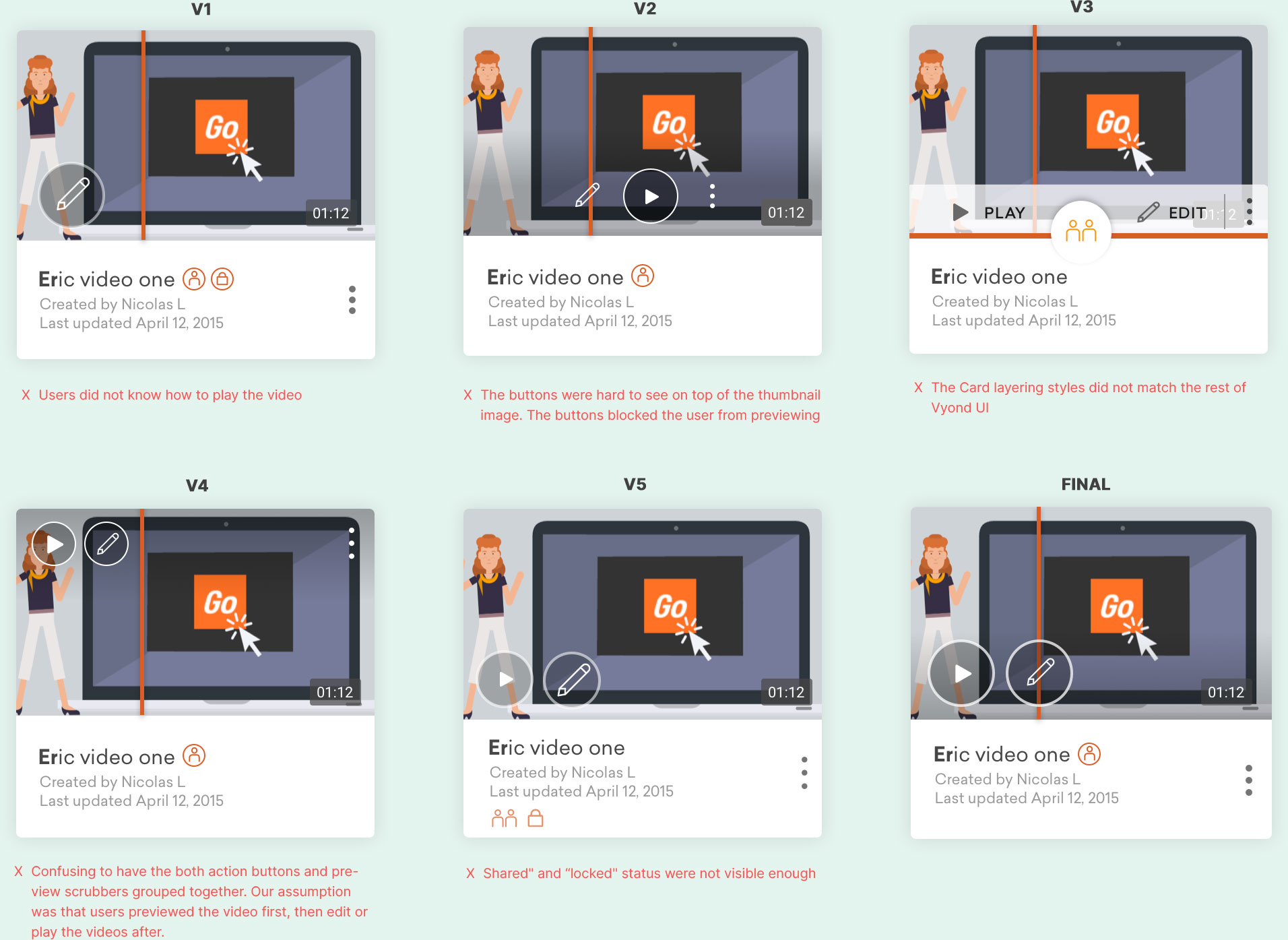
Our research informed us that users thought that the video thumbnails too small and hard to glance. They wasted a lot of time in carefully labelling their videos. As a result, we introduced a grid view of cards to replace the list format.
By displaying them in cards and allowing users to preview on the video page, we enabled them to find their videos quickly.
An Optimized Video Player Page
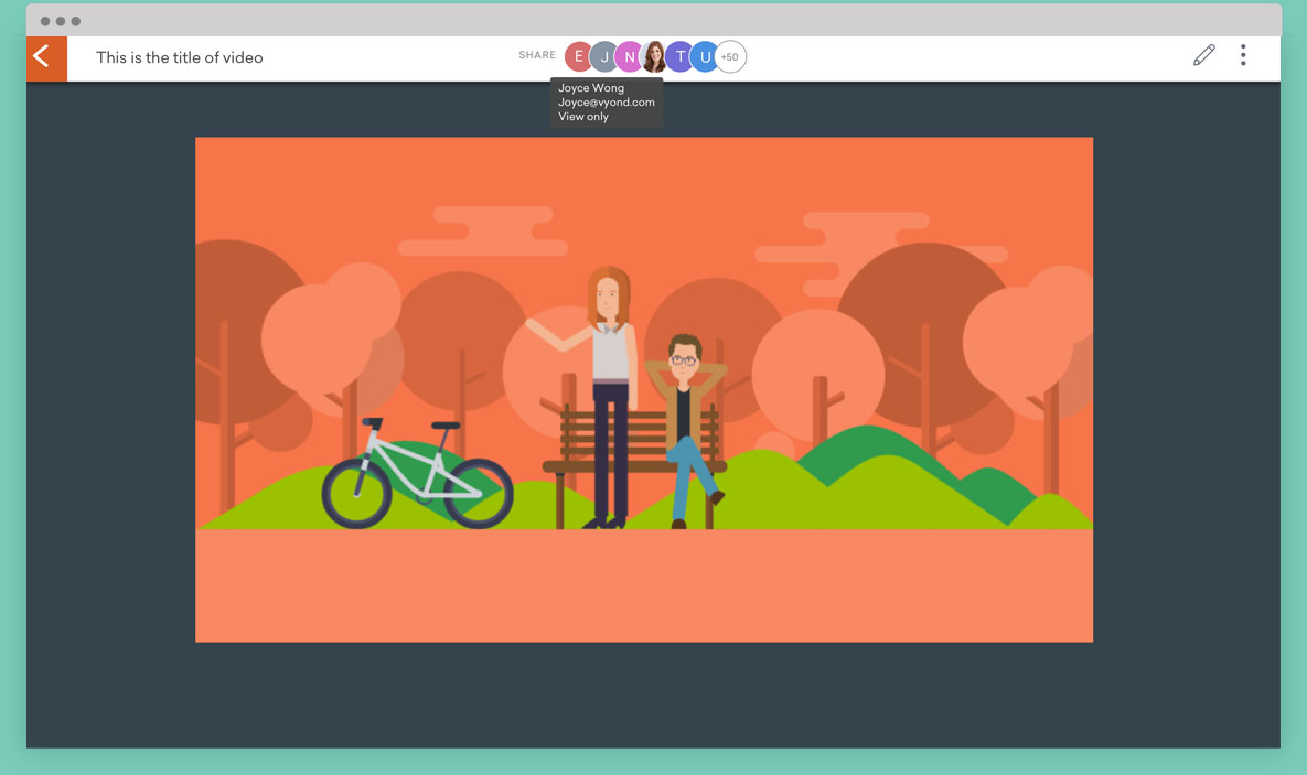
The idea of the new video page was a “full page version of the video card” i.e. we reused and repositioned same components.
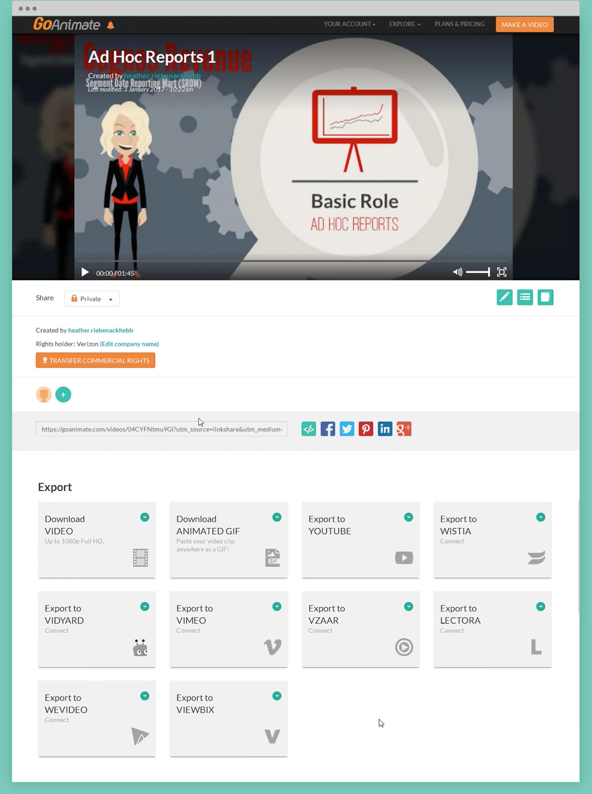
Based on user research, we removed the less used features, such as “Export to YouTubes; Primary actions such as “Download” and “Shared” features were moved to the top; The main nav bar was eliminated as the user journeys did not suggest that it was needed.
The result was a more user friendly and immersive viewing experience.
Learnings
01 LEARN TO SAY NO
This seemed to be a small project at first, but through the interviews, we discovered more and more usability issues and user needs.
It was overwhelming at first about where and how to fix the problems. In the end we decided to say NO to certain features and put them in the back log.
For example, we were aware that there might be needs for searching "folders names"; However, we decided to keep it simple and MVP first . If users found a need for it, this would be thought of later.
This required a different mindset because as a designer I wanted to make everything perfect, but I learned to be more agile and put some ideas behind.
02 KEEP IT SIMPLE AT FIRST
When we replaced the list view with the card view. We were awared of it’s disadvantages, for instance, the size of cards toke up spaces and they looked draggable; However, instead of building both card AND list views, we decided to design with only one view at first and validated it’s effectiveness before creating more UI components.
Next steps would be testing.
