Vyond Design System
How might we enable designer, engineers and product owners to build more consistent Vyond products?
I worked with another UI designer at Vyond (formerly GoAnimate) to create a universal design and documentation system that enable the teams to collaborate more effectively and ensures design consistency.
TEAM
Head of Design
UI Designers
UX Designers
Engineers
RESPONSIBILITIES
UI Design
Research
The Context
When I joined GoAnimate in 2012, it was still a startup company. There were no style guides, Sketch files, nor guidelines. Nothing. I realized I had to start from scratch. I came up with a style guide to maintain the consistency of the website and revamped the Video Maker's look and feel so that at least it looked more professional. However, as our product range continued to expand and more features were released, we realized what we needed was more than a style guide.
BEFORE AND AFTER
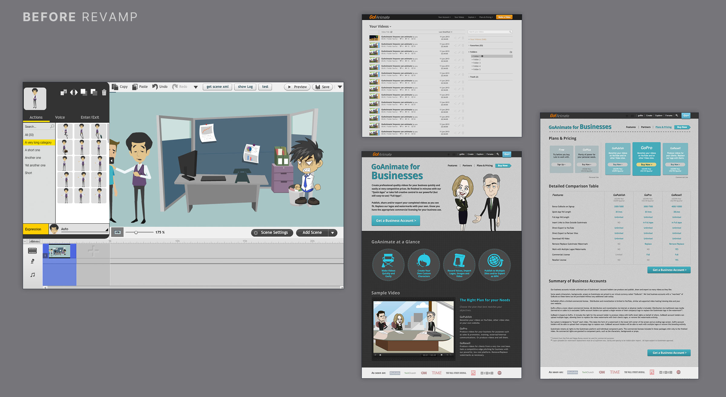
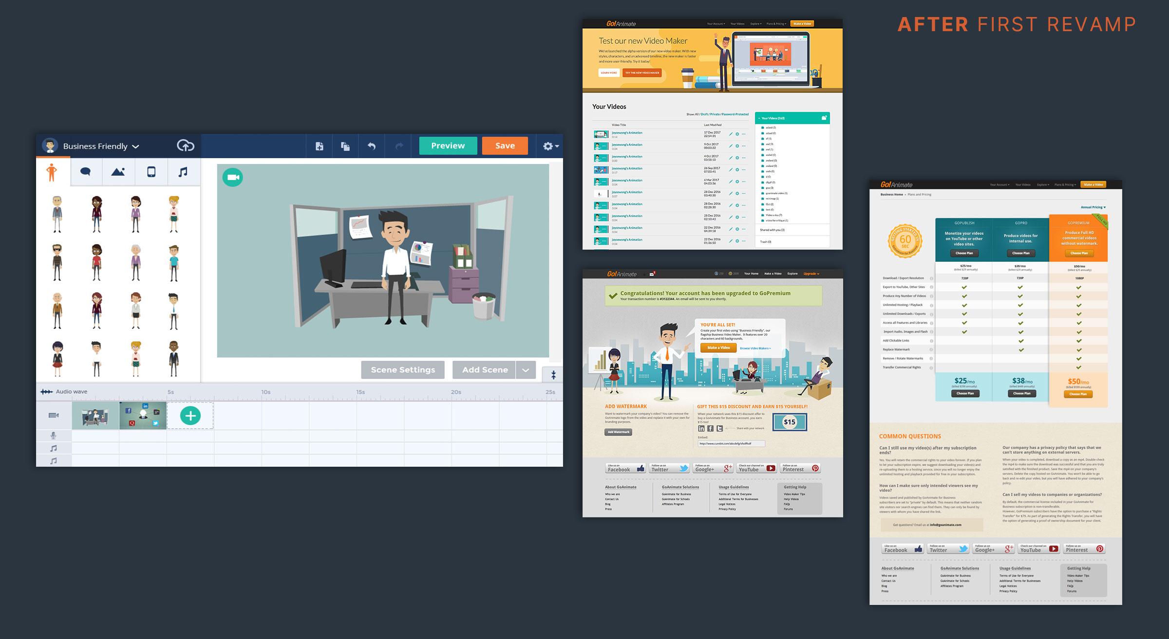
The Problems
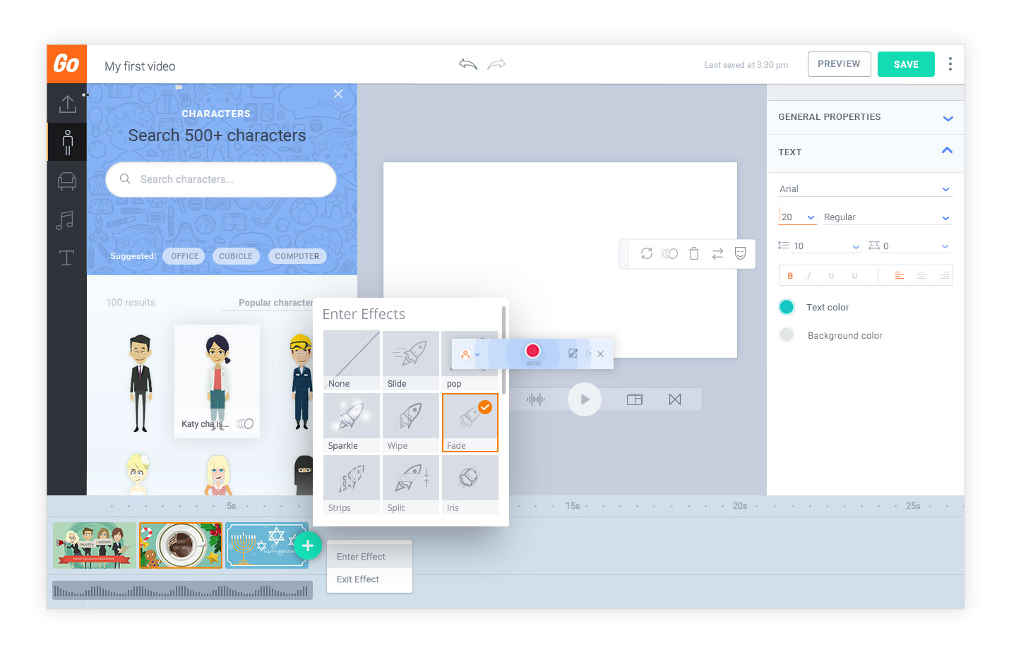
In 2017, we started to rebuild the Flash-based Video Maker to HTML5. When designing the Video Maker, we became aware of some internal problems:
KEY PAIN POINTS
01 Designs were custom-built and not reusable
02 UI lacked consistency
03 UI, UX designers, and engineers had their own versions of UI components
04 Video Maker and Vyond.com website followed two different sets of styles
Research
MARKET RESEARCH
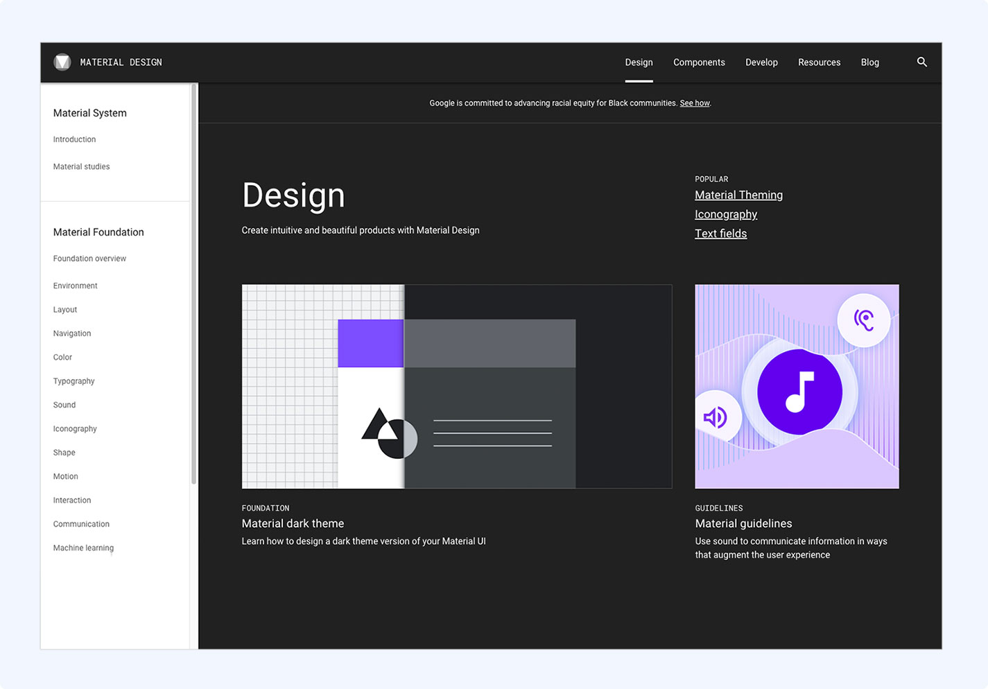
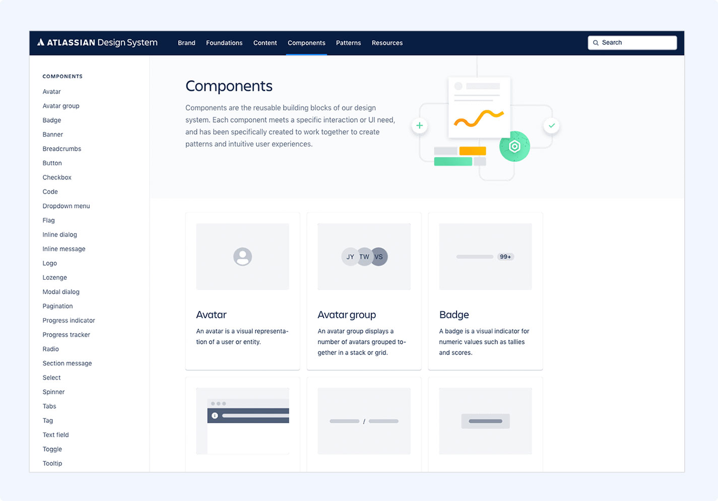
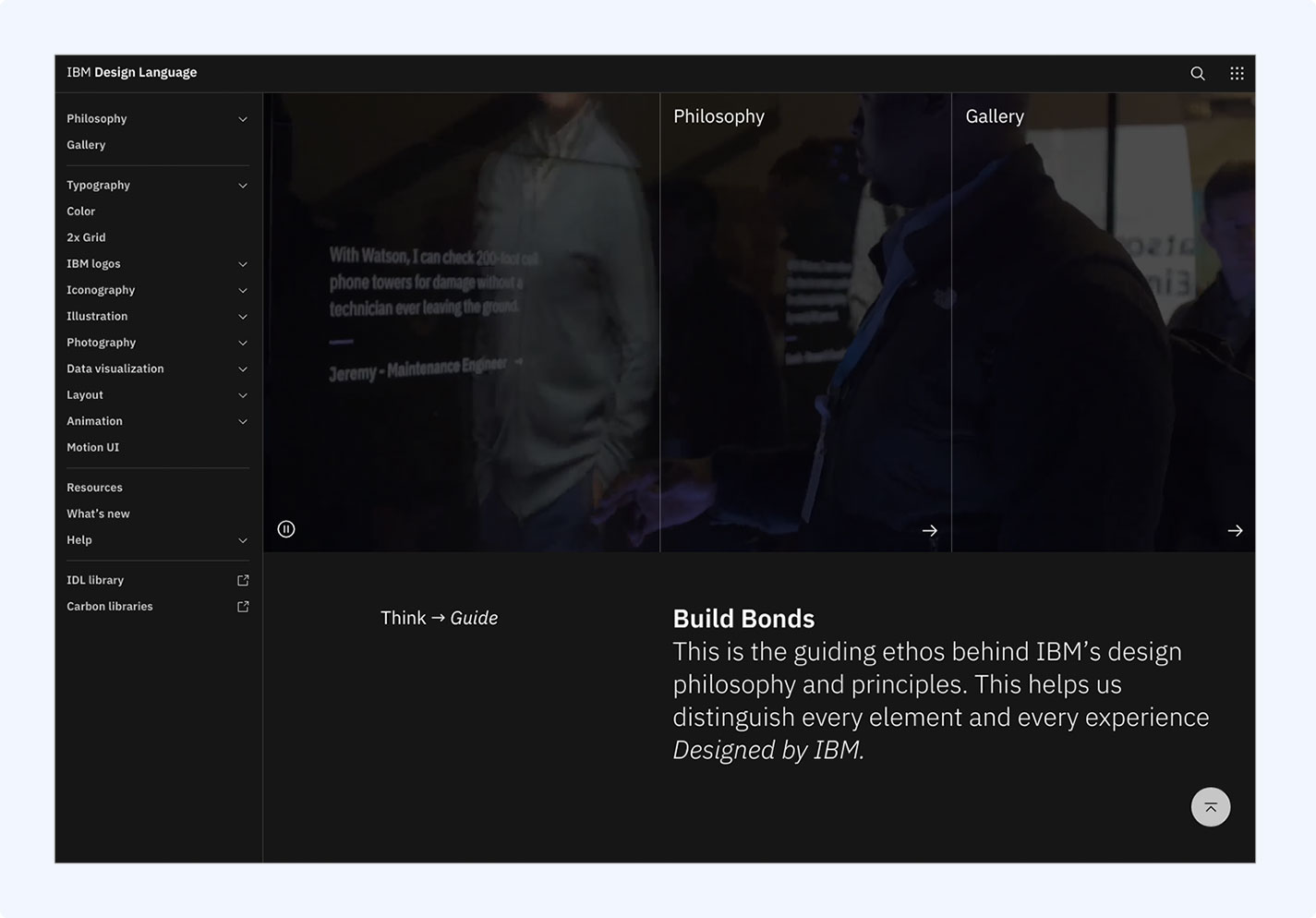
How to create a design system for a growing web application? I researched on design systems laid out by Google, Atlassian, Lonely Planet, Airbnb and Marvel Studio. I tried to understand why they work well for their organizations.
UI Audit
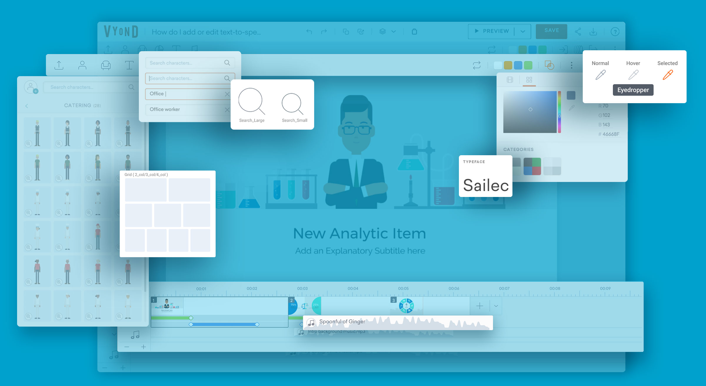
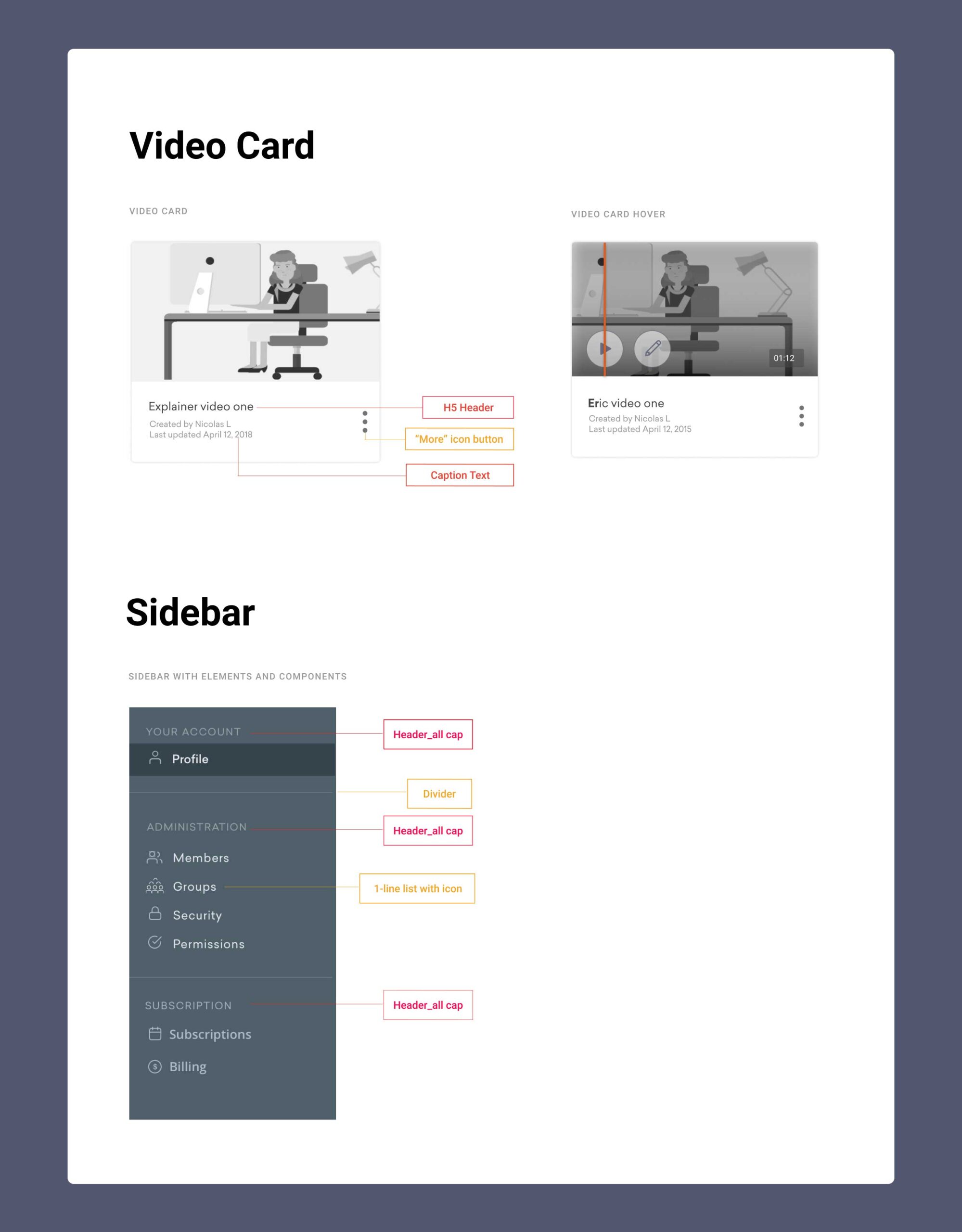
With the help of another UI designer, we worked on defining a design system. I began to capture every UI element in the Video Maker as well as the video listing page, then we categorized them.
The Atomic Approach
THE ATOMIC APPROACH
The structure of the design system is based on the Atomic Design principle pioneered by Brad Frost. Drawing inspirations from chemistry, the principle provides a hierarchical way of describing UI components.
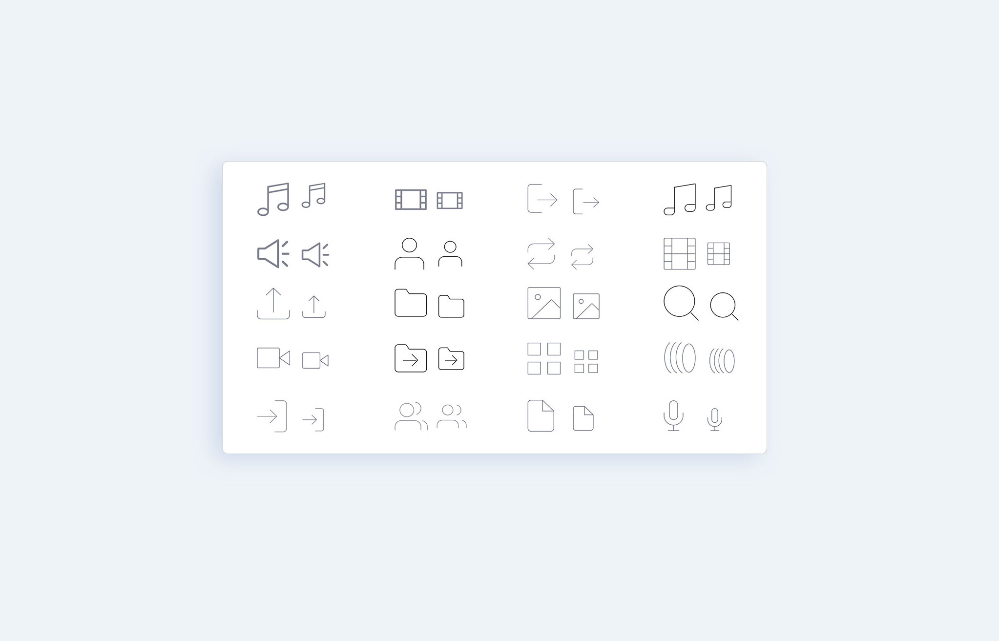
ELEMENTS
Basic building blocks in a UI
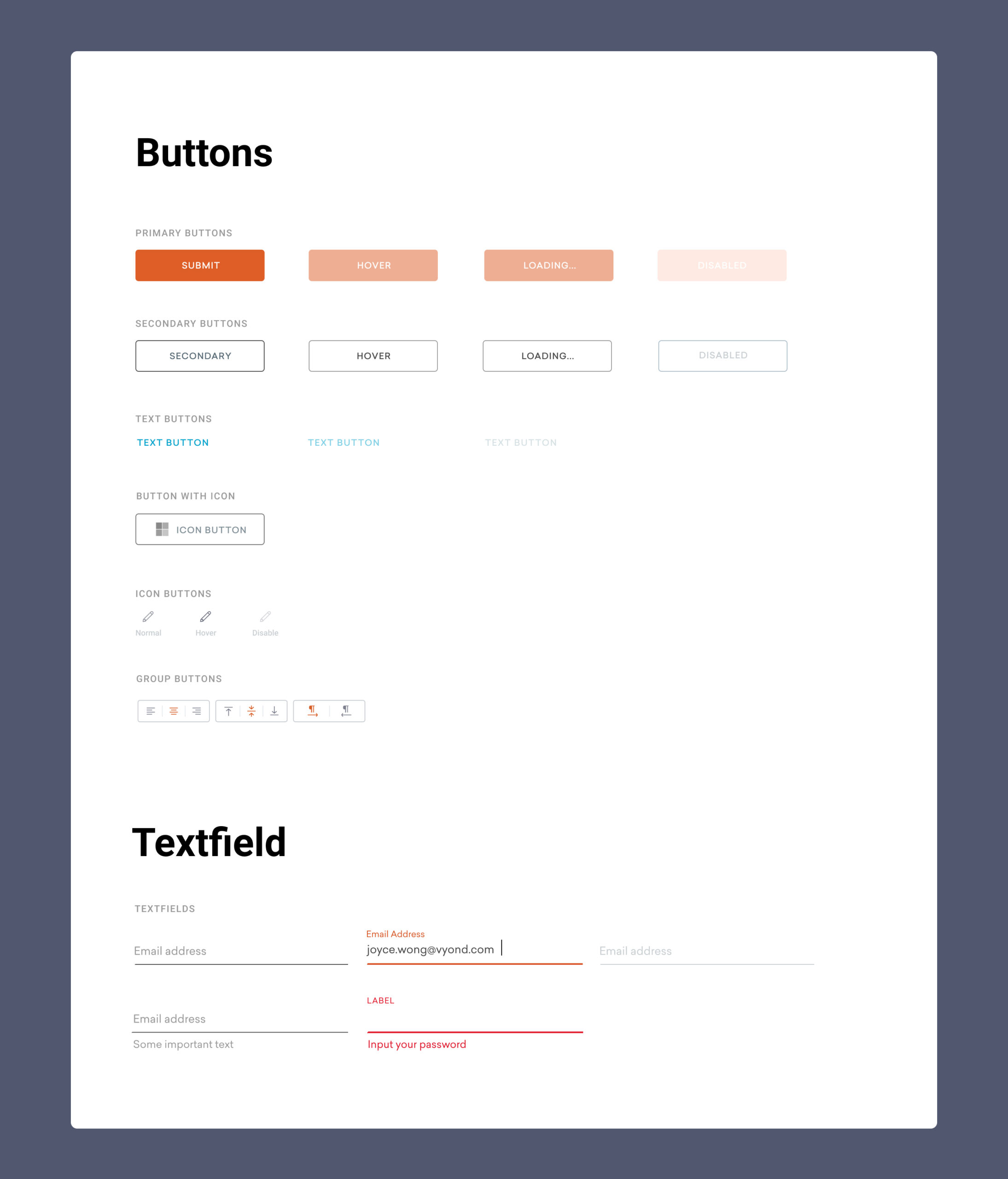
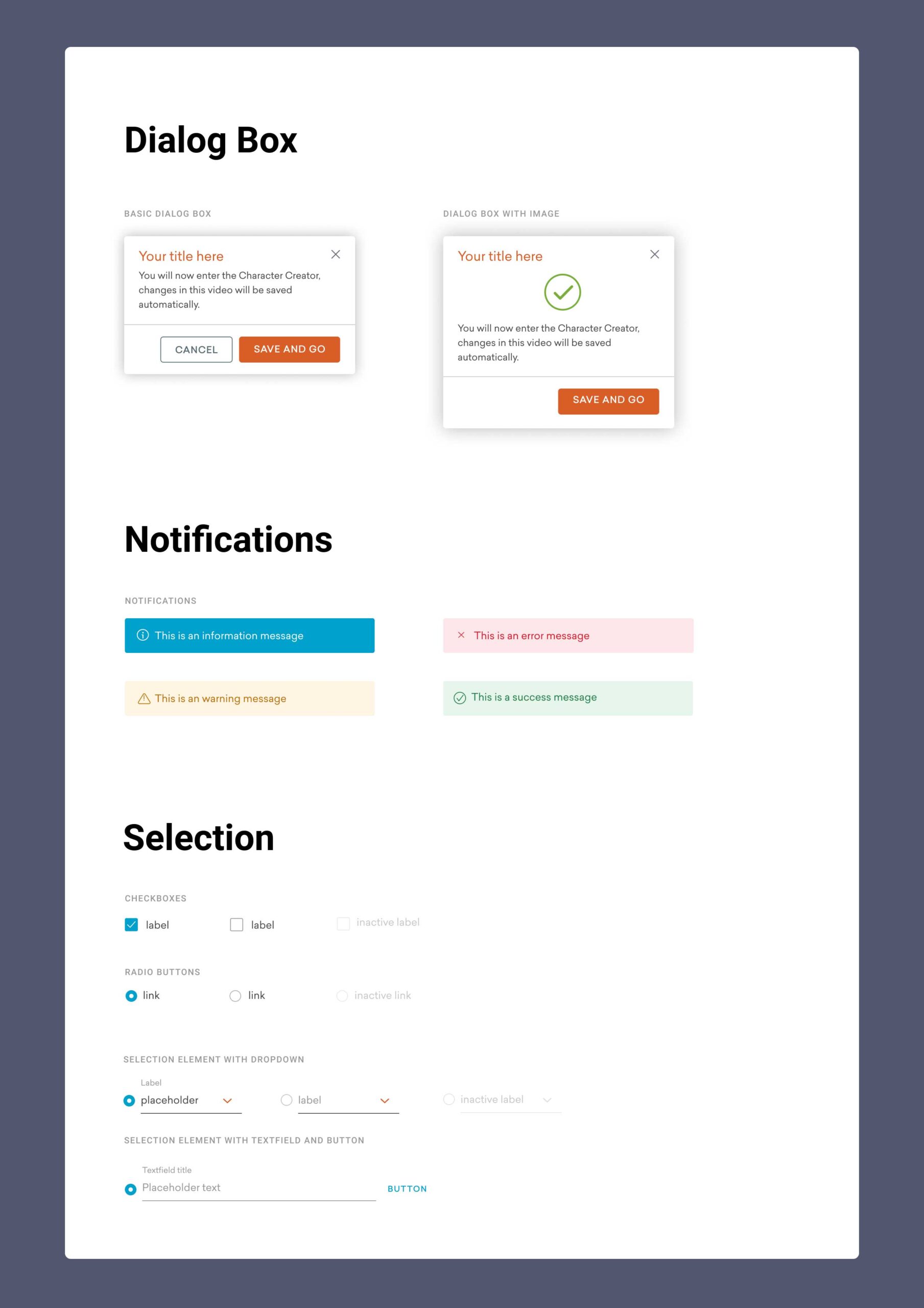
COMPONENTS
Formed by combining the elements
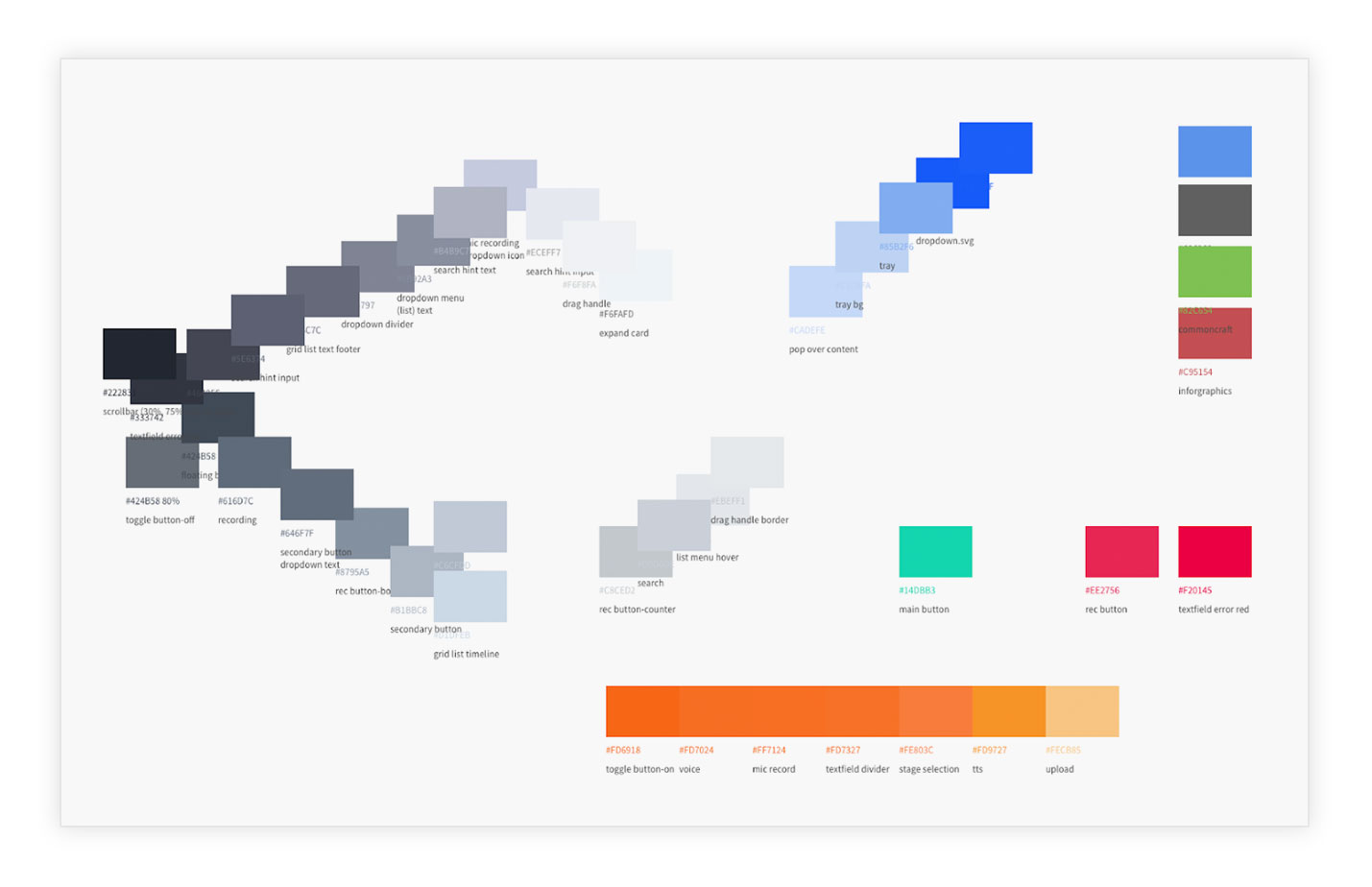
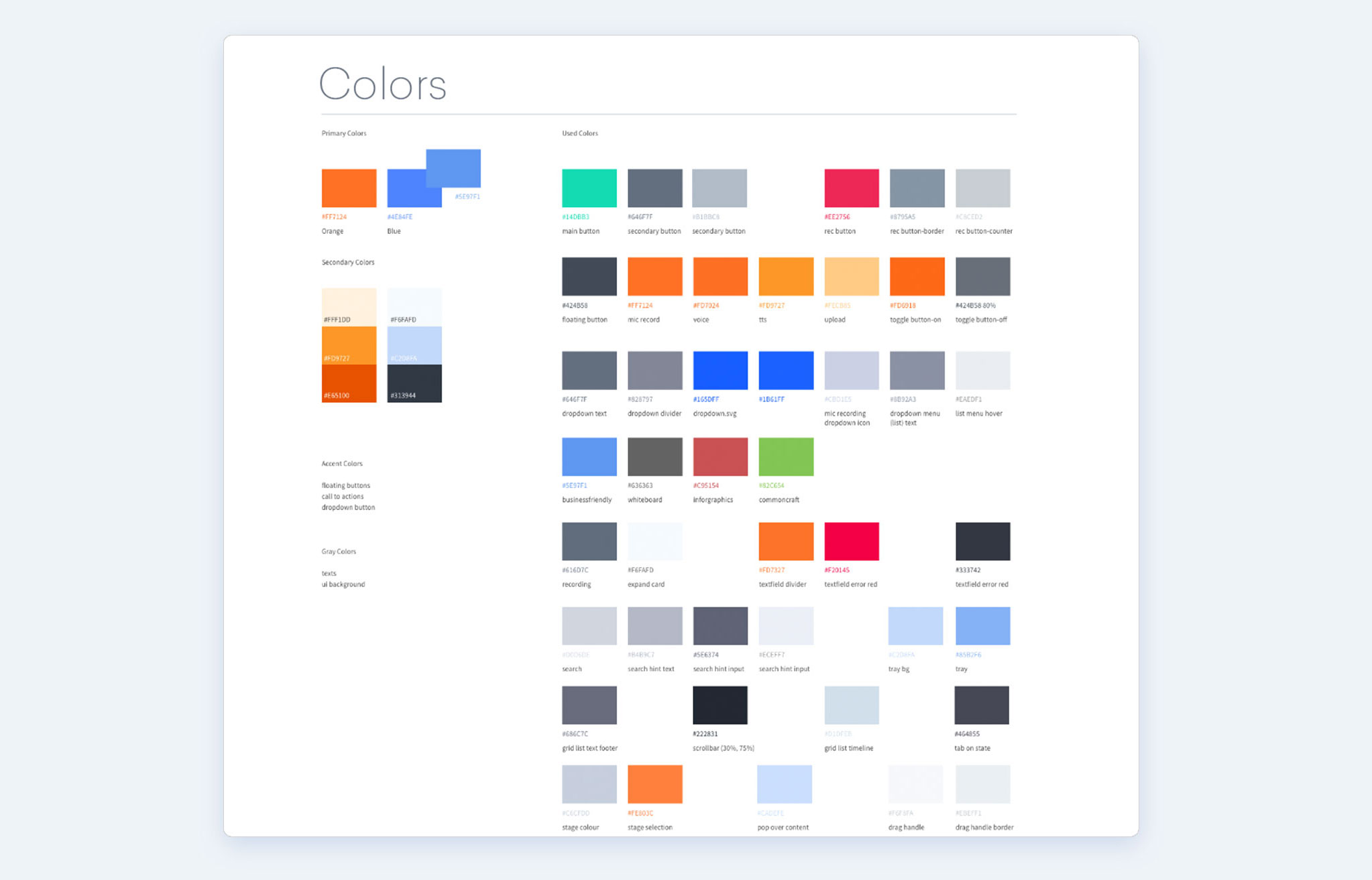
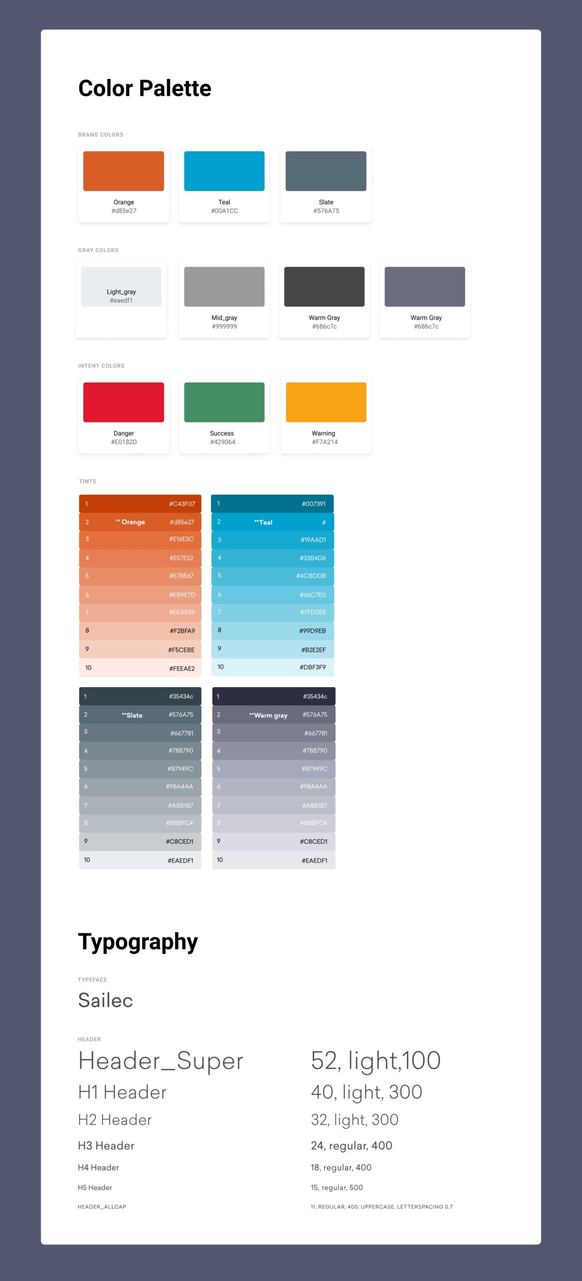
STYLES
A style defines the look. Examples include typography, colour palette, illustrations and icons.
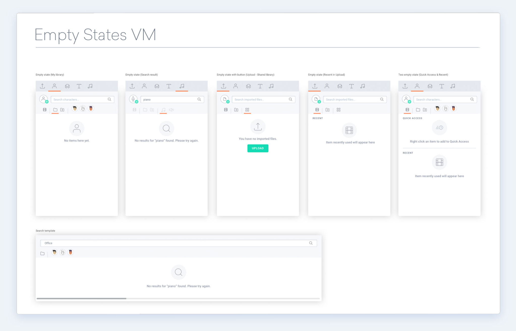
TEMPLATES
Generic page layouts put together by elements and components
ELEMENTS
COMPONENTS
STYLES
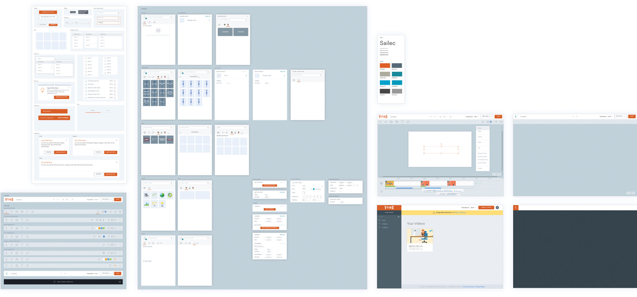
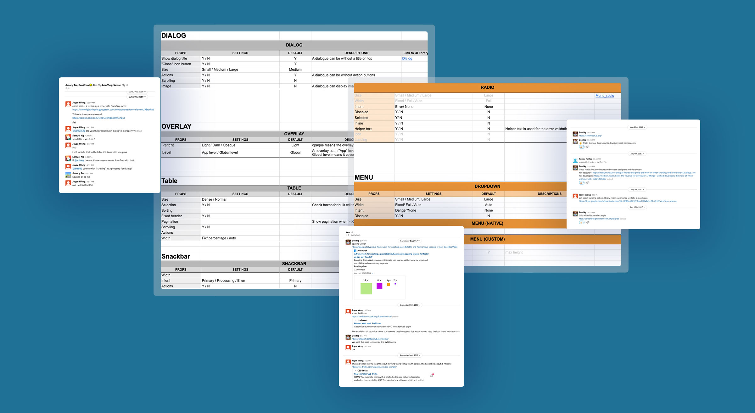
SPECIFICATIONS FOR INPUT FIELD
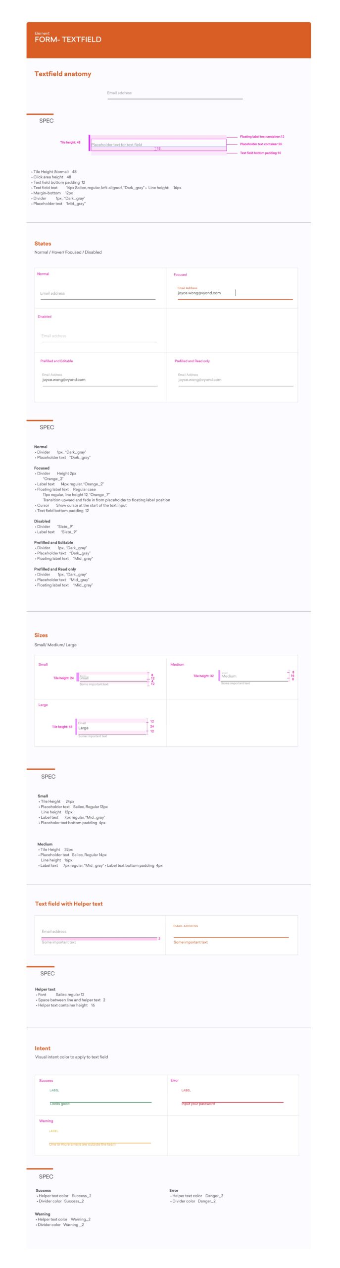
Specifications
COVERING ALL STATES
Each component was clearly defined with all “states” in the system. For example, a form input can have one of the following states: placeholder, hover, focus, filled out, error, and disabled. Having all states defined saved a lot of time when designing wireframing and prototypes.
Ideally, my goal was to create a live website that documented all the patterns, usage guidelines, examples, and centralized codes; However, due to limitation of time and resources, I simply started with Google drive, PDF and XD prototypes.
UI KIT USING SKETCH
Discussion on Components
CONSISTENTCY & ALIGNMENT
One of the goals of the design system was to get designers, engineers and product managers to speak the same language. We held workshops and tried to come up with consistent naming conventions that could be applied to both design and code.
Learnings
01 INCREASE IN EFFICIENCY
In the beginning, there was some resistance to create a unified design system, as extra time and effort were required.
Over time the benefits started to emerge. With a design system, I found that I was able to create hi-fi mock-ups faster. UX designers could focus more on thinking about the user experience and problem-solving, but not on re-designing the UI over and over. It also improved communication with engineers.
02 SAY "NO" TO THINGS
Being a UI designer means being a gatekeeper to the product's design system. There were times when designers needed to be creative and experiment with new interactions and patterns; However, most of the time we should use what the design system offers and reduce the amount of unnecessary design debts created. Failing to do so means either the system fails or the team not understanding the game rules. This is challenging, and as a designer I value creativity and uniqueness, yet we need to strike a balance when working on product development.
03 THINGS I WISH I CAN DO BETTER
It is always a challenge to connect the product team with the design system.
How to get other teams informed and excited about the design system? How to get design and code in sync? How to update changes made in the components? When to summit component change in the sprint?
I think a practical design system cannot just live in a vacuum; it requires collaboration between designers and developers.